reMarkable Stacks
Time as organization paradigmreMarkable Stacks is an exploratory concept for the UX of the reMarkable 2 device, focusing on opening up the content of files to create a more transparent experience.
The project was nominated for the AHO WORKS AWARDS in the category Interaction Design.
OSLO SCHOOL OF ARCHITECTURE AND DESIGN
2023 – 4 WEEKS
SOLO PROJECT

As an alternative to folders, Stacks has a tagging system making it possible to categorise a file into more than one category.
It also enable users to work in a “space” rather than a folder.

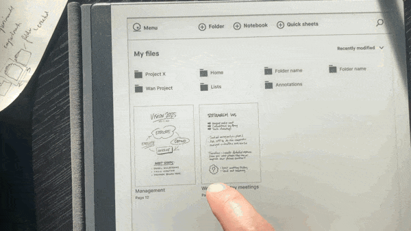
The re-design makes it possible to preview the content of a file before entering it, avoiding the problem of menu diving.
THE PROBLEM
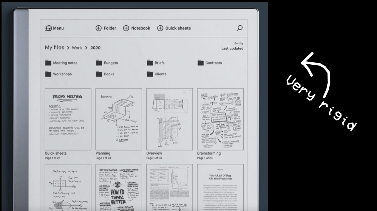
The current UI has a traditional folder structure. This suits some users, but many are requesting a more visual way of navigating.
METHODOLOGY
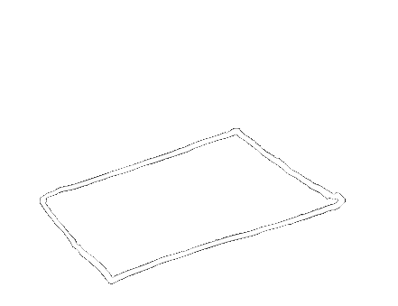
The task from reMarkable was to explore time as an organizational paradigm for the UI.
I interpreted time as chronology. Leading me to the idea of a stack of paper where the old is in the bottom, and the new on top.

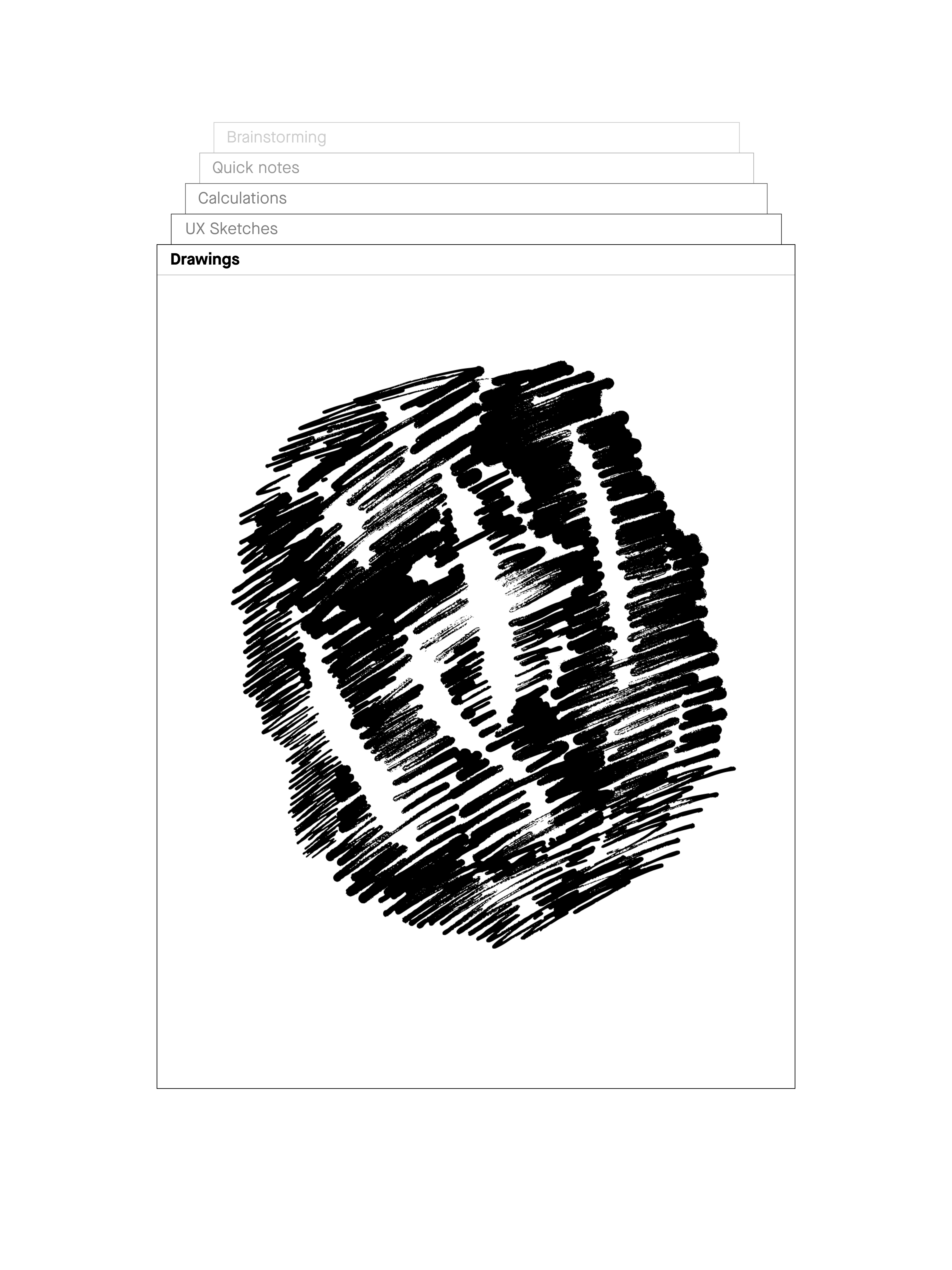
Visible sidepanels
QUICK FIX
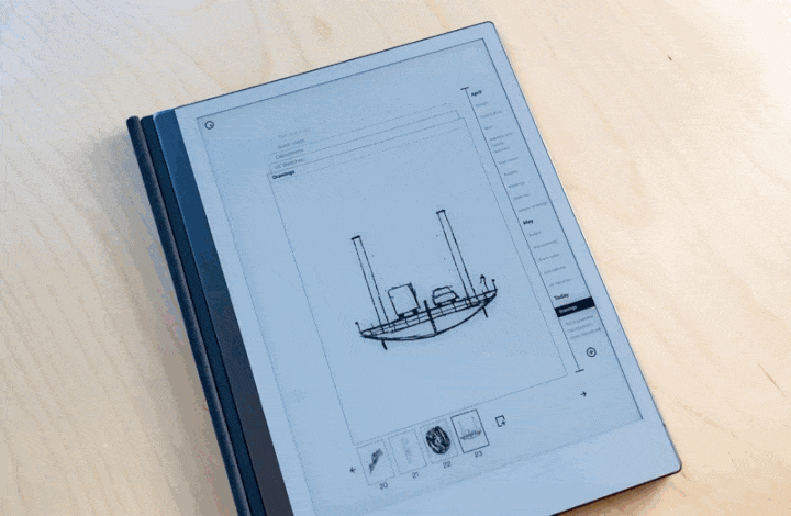
Many users complained about having to enter a file in order to view its content.
As a quick fix for reMarkable, I prototyped a swiping gesture to preview the content of files.
window size
x
x