Editorial design
Art Direction for Kote
- Year
- 2020—21
- Role
- Art Director & editorial design
- Skills
- InDesign & print
- Client
- +Kote
+KOTE is an independent student-led publication exploring our physical surroundings through architecture, urbanism, landscape and design.
As Art Director, I developed the visual identity and art direction for three issues, translating each theme into a visual language.
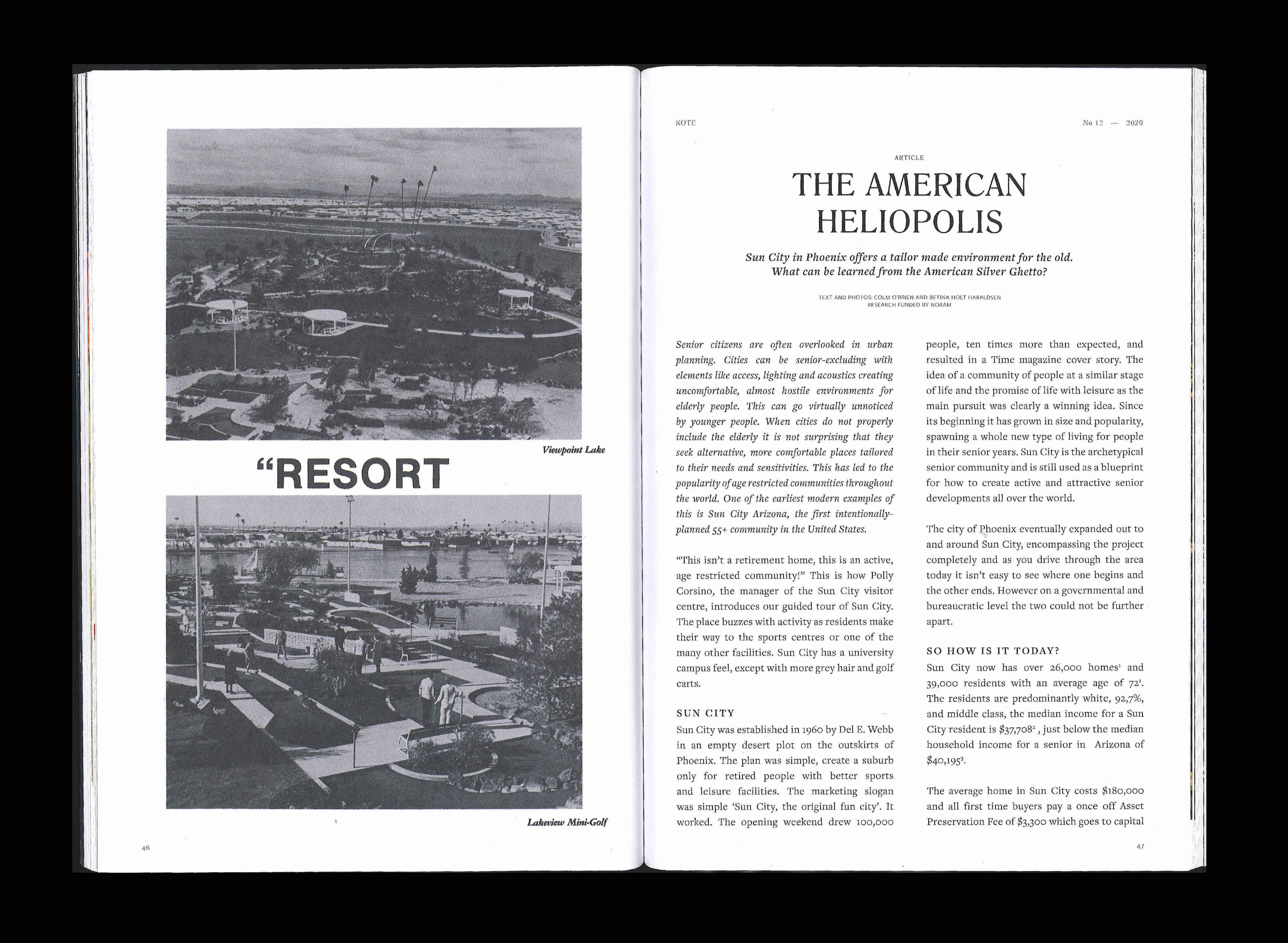
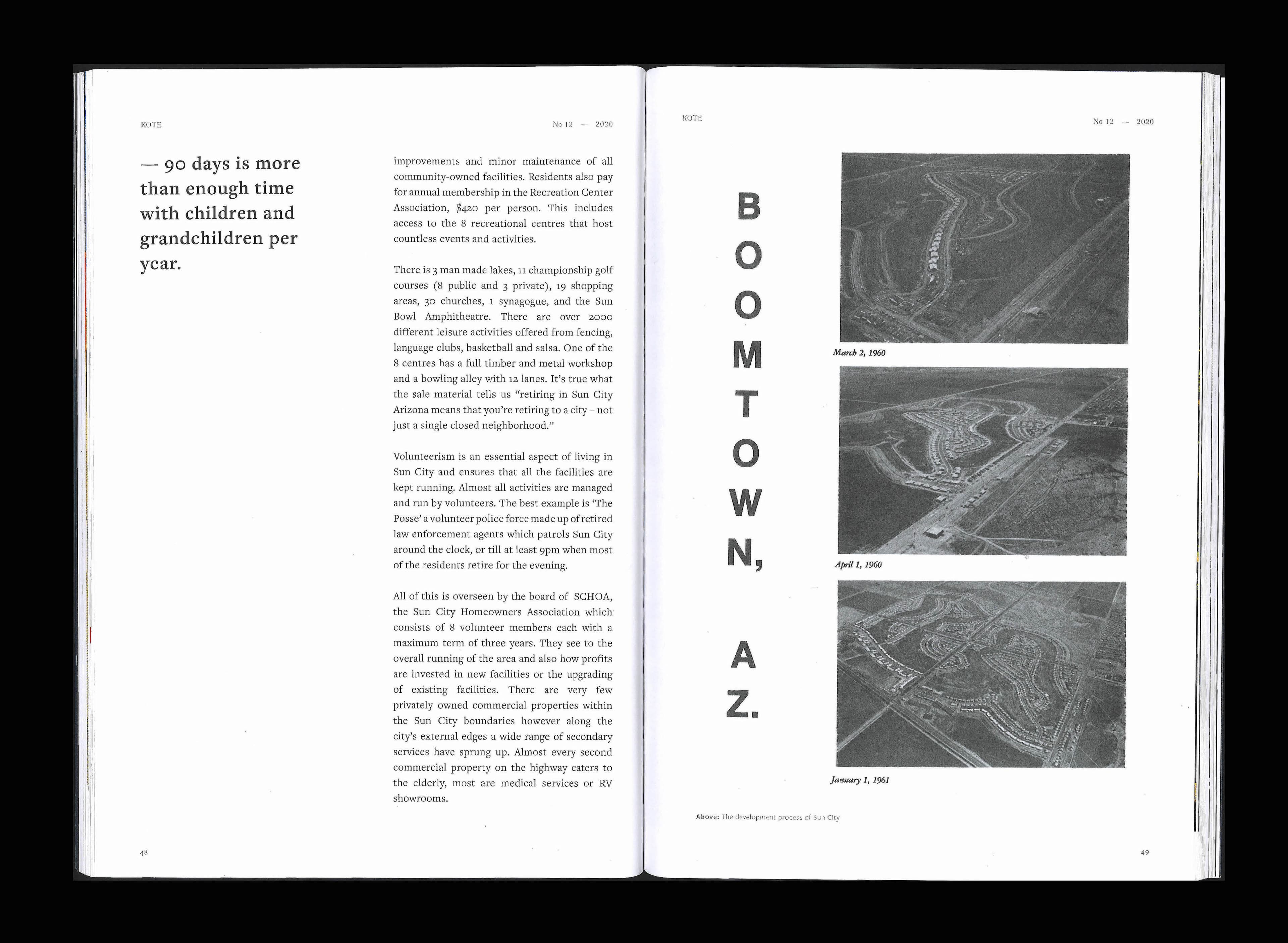
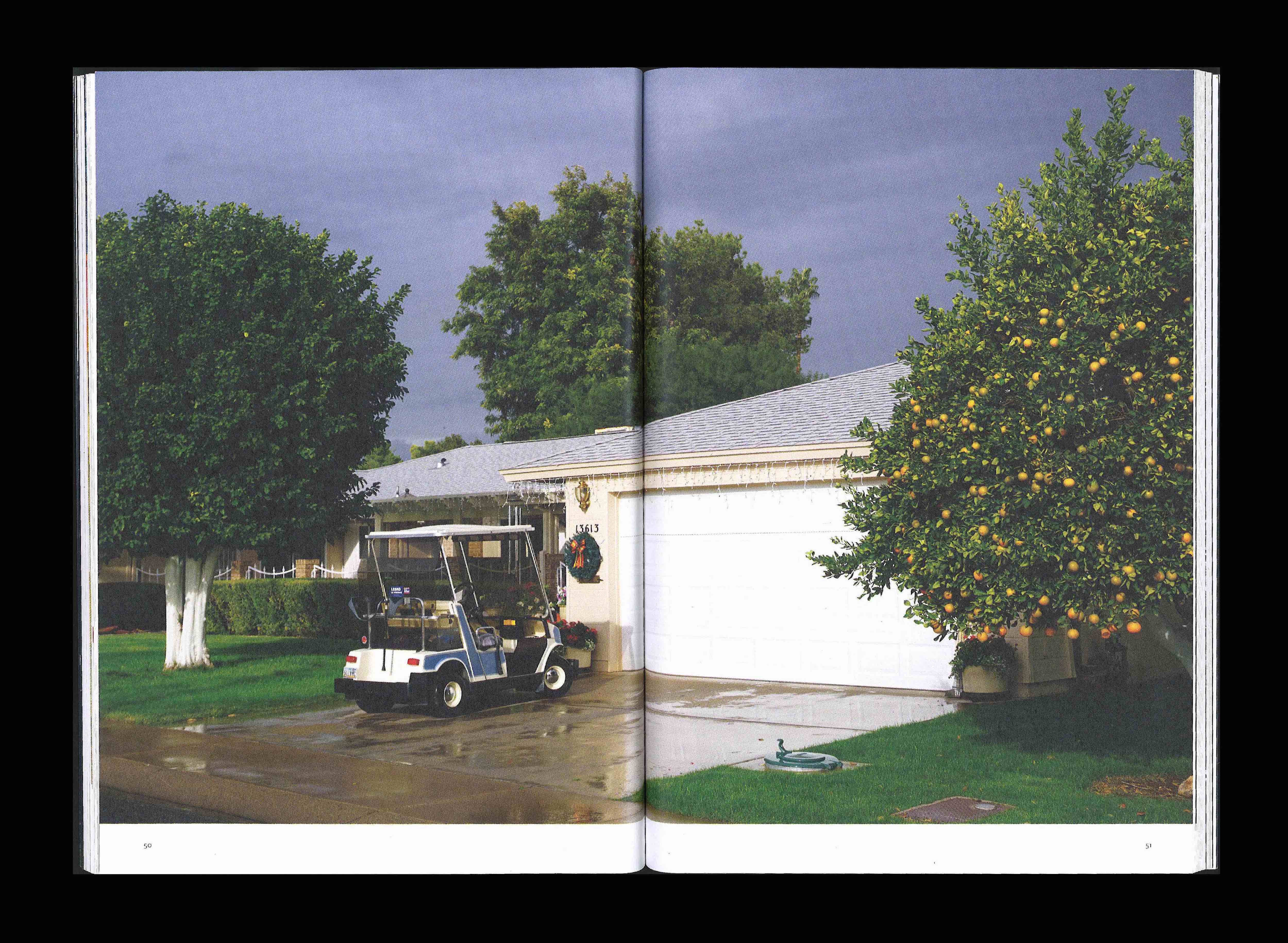
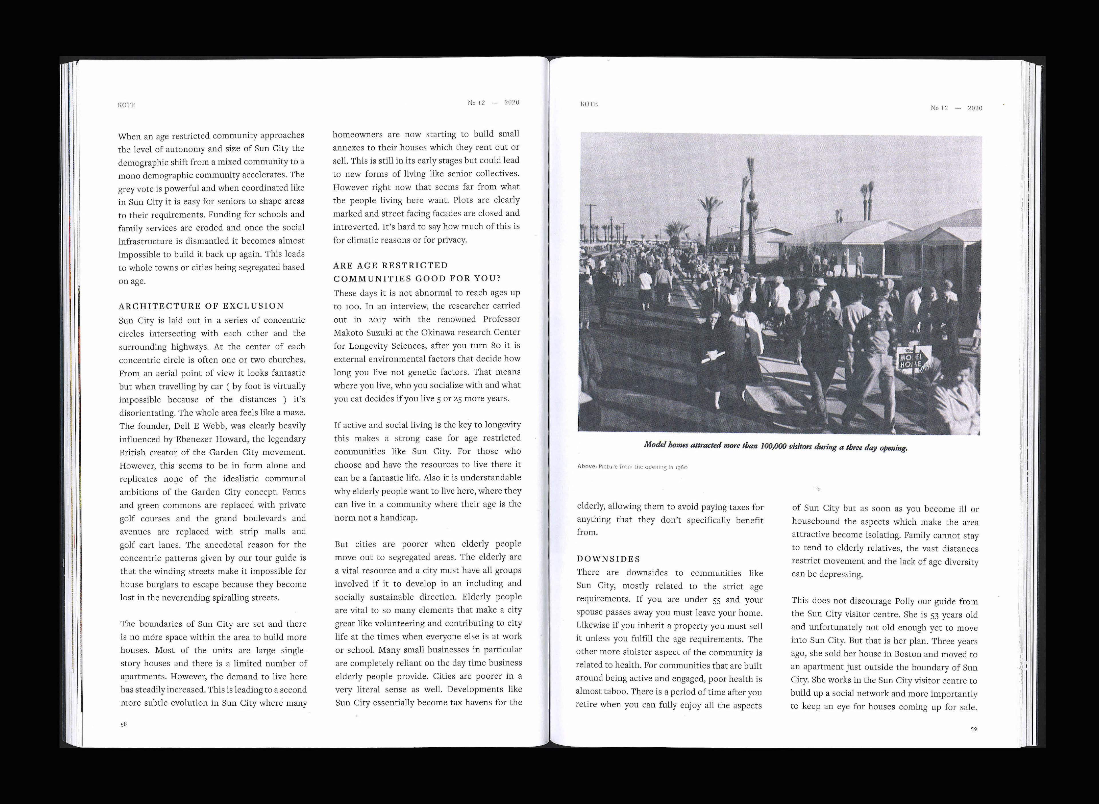
Kote No 12 — Inkludering / Ekskludering explored inclusion and exclusion in urban settings. I created a simple, flexible typography system as the baseline for future editions.
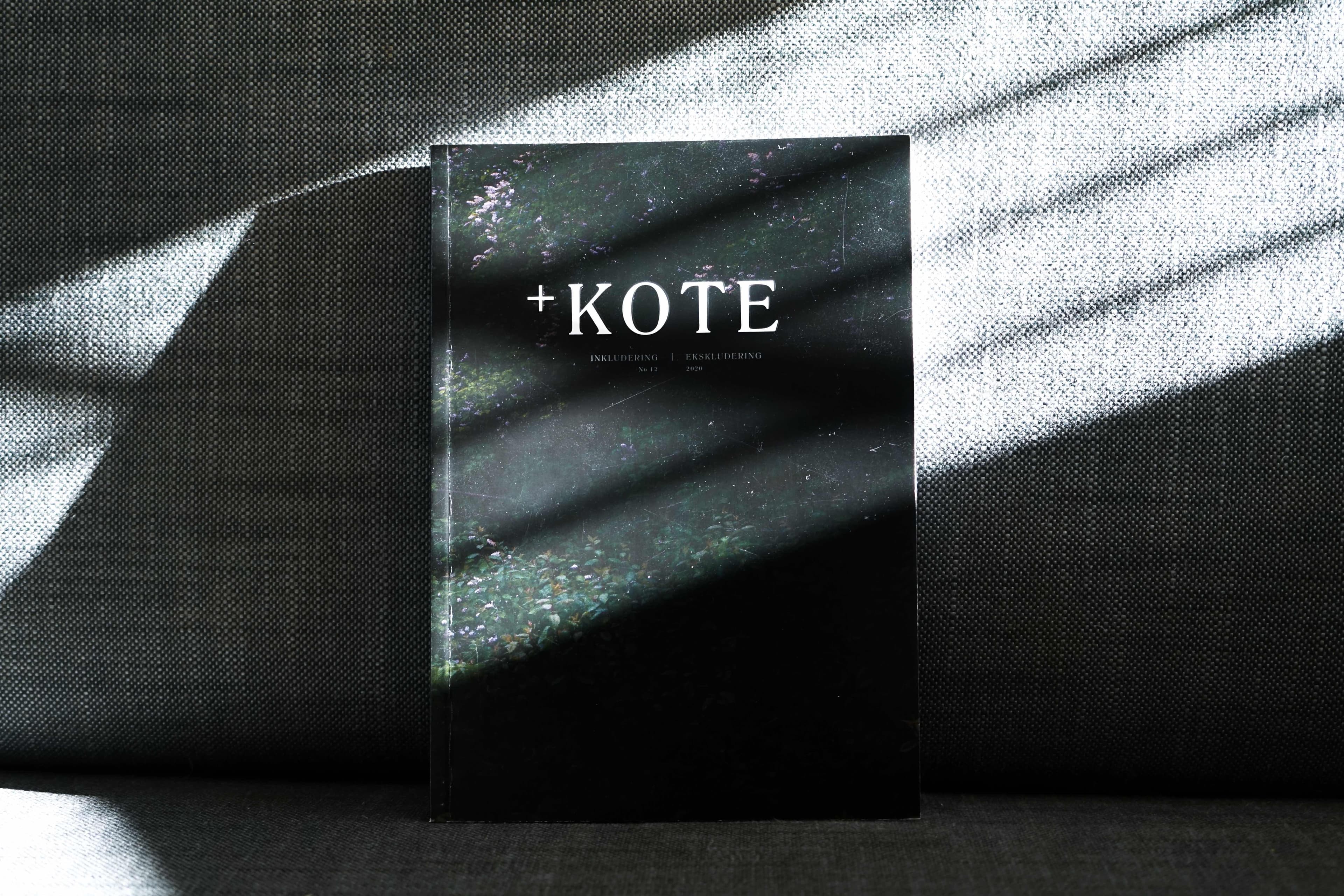
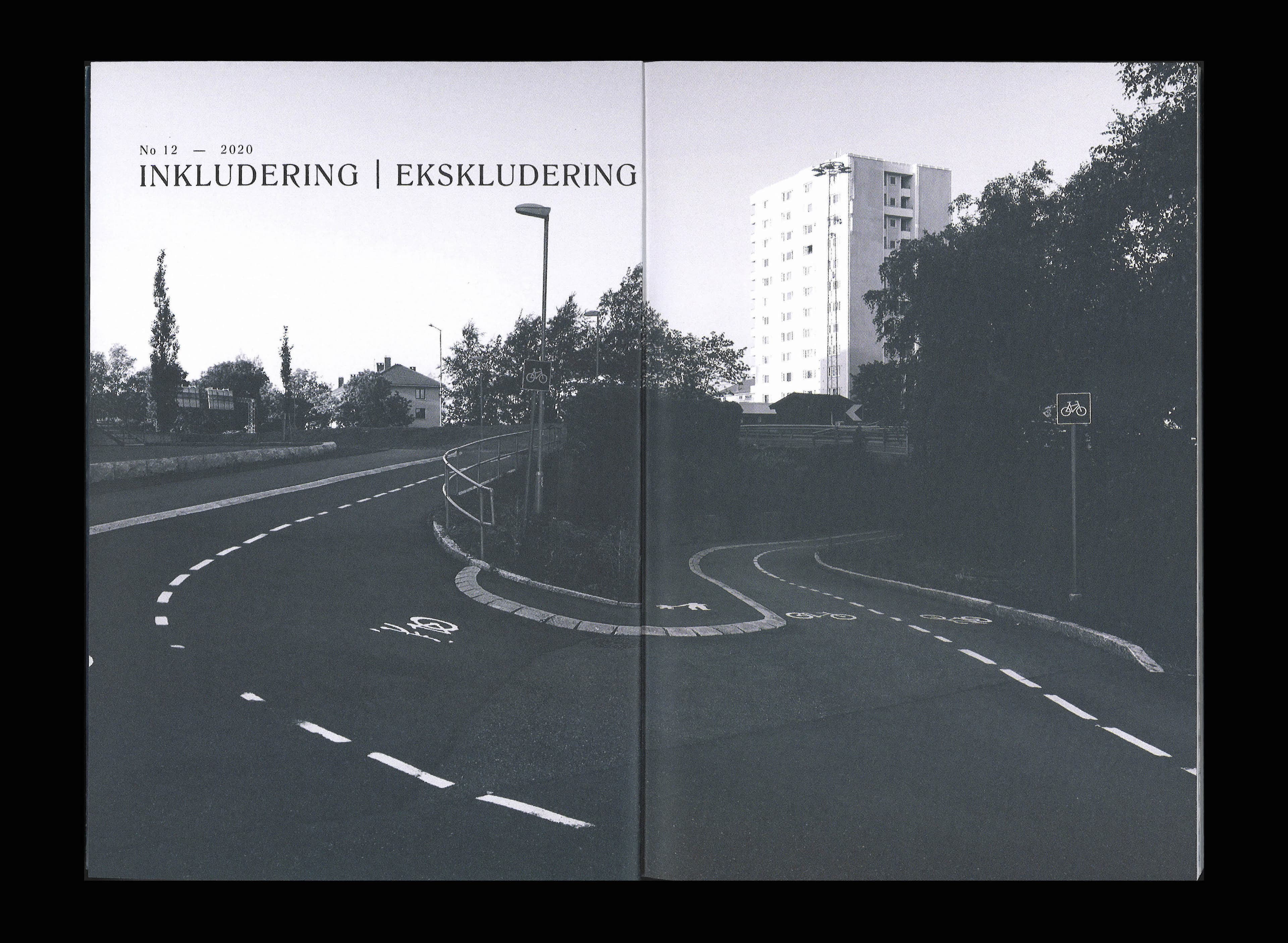
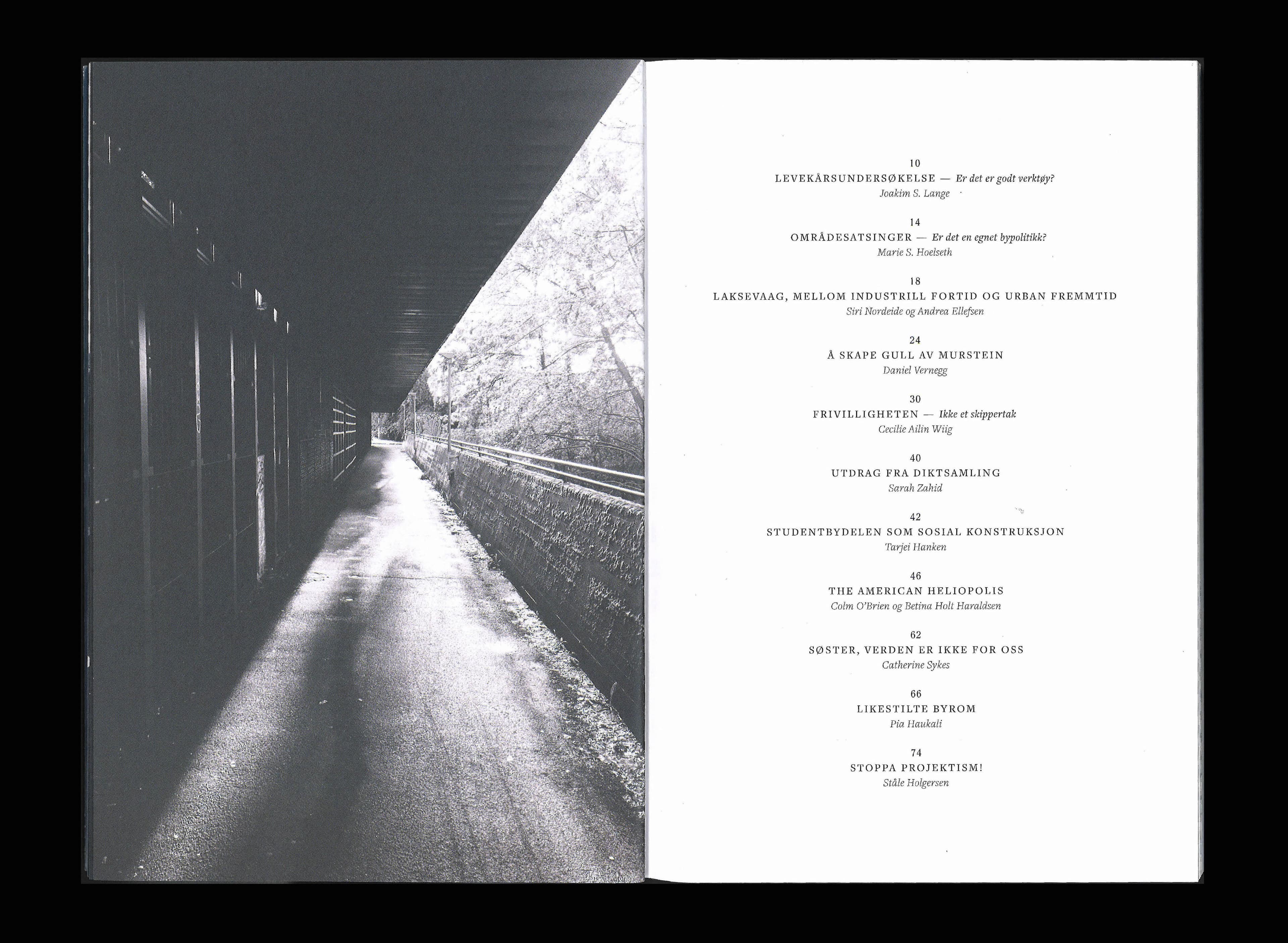
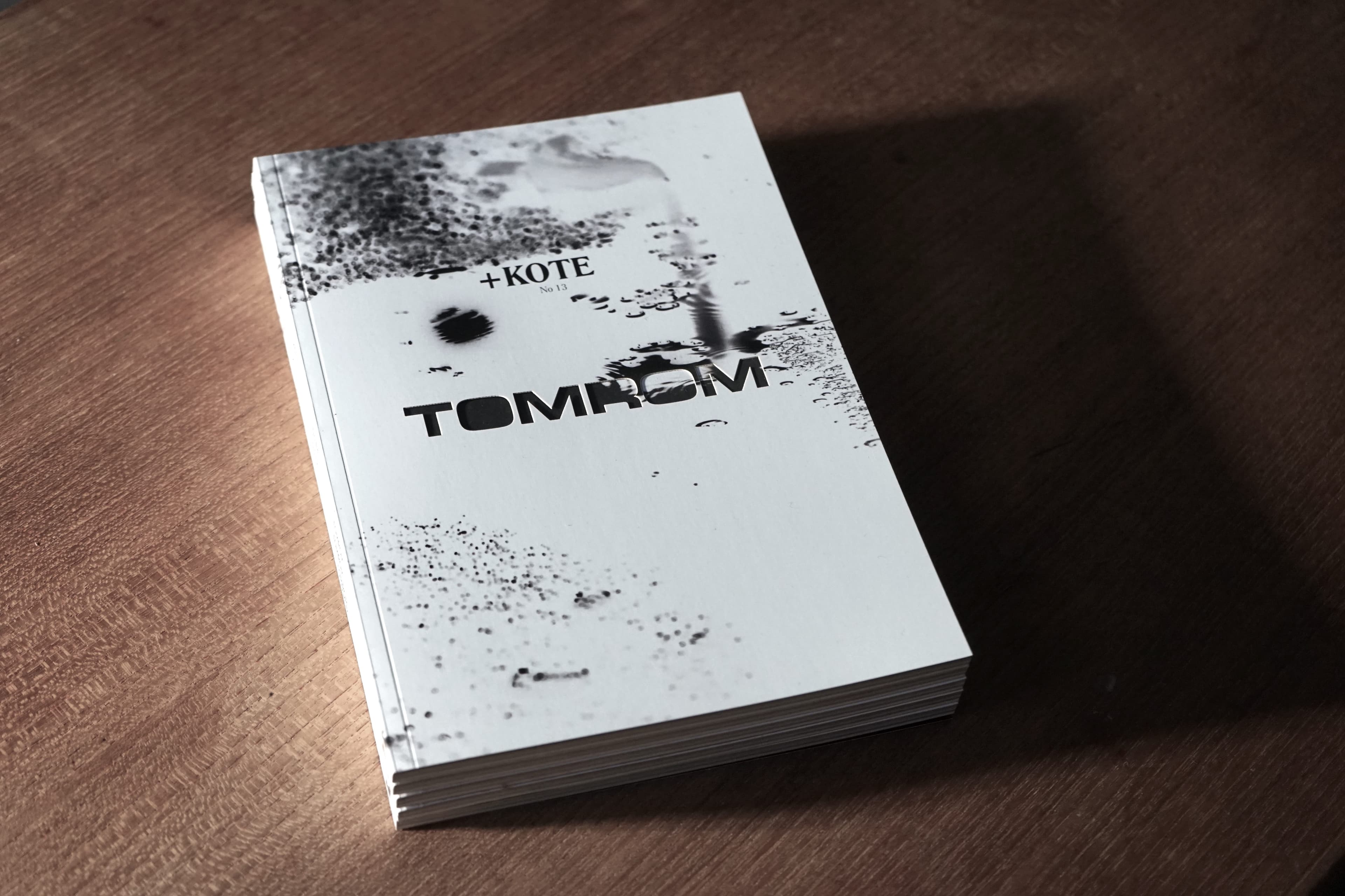
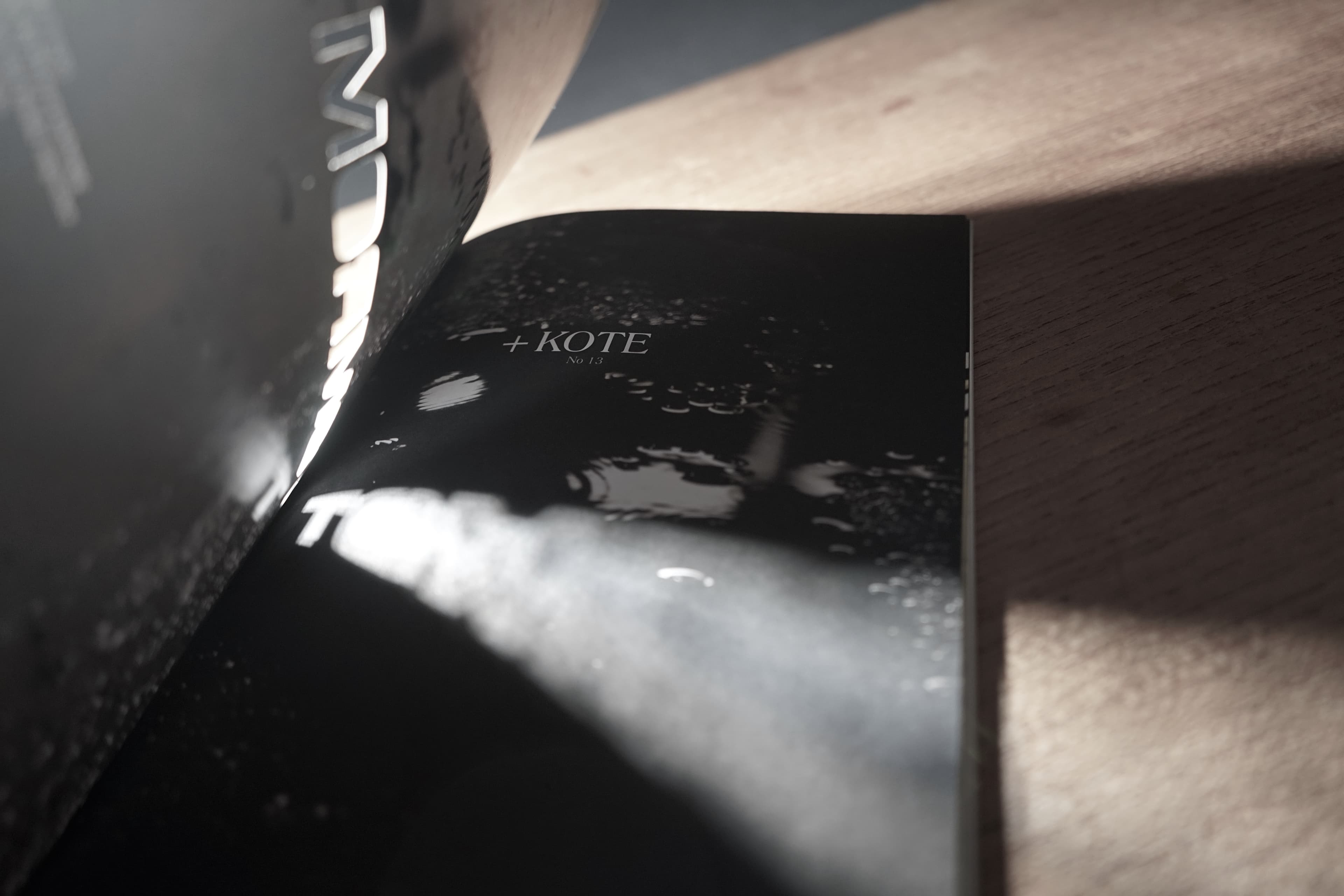
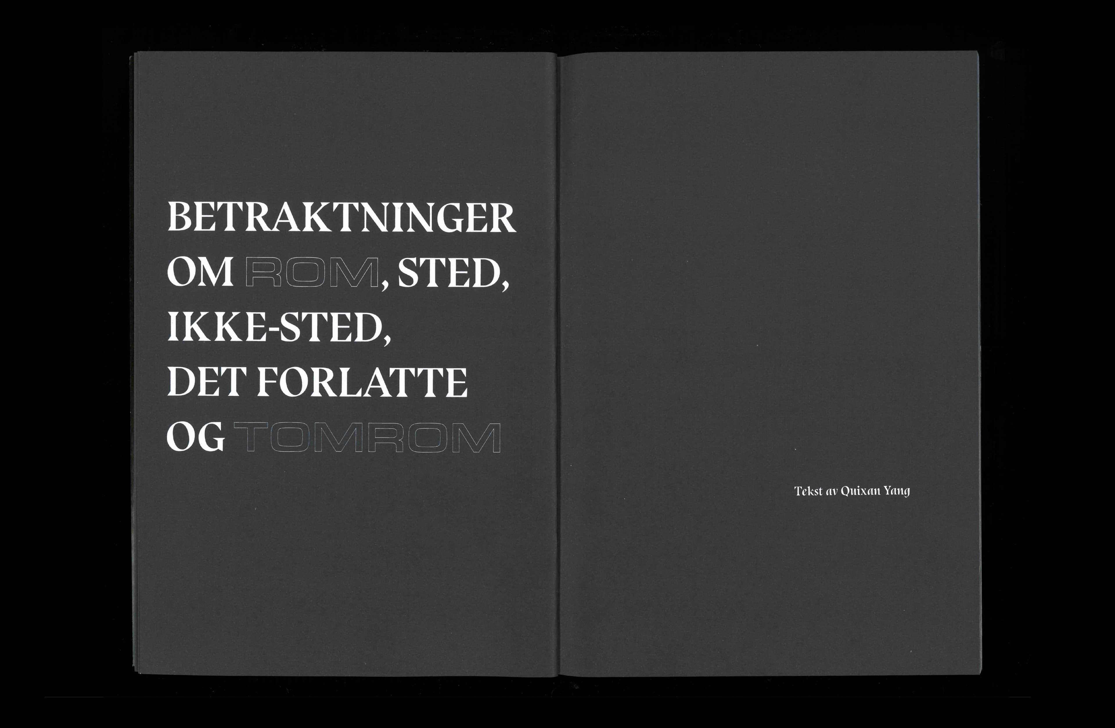
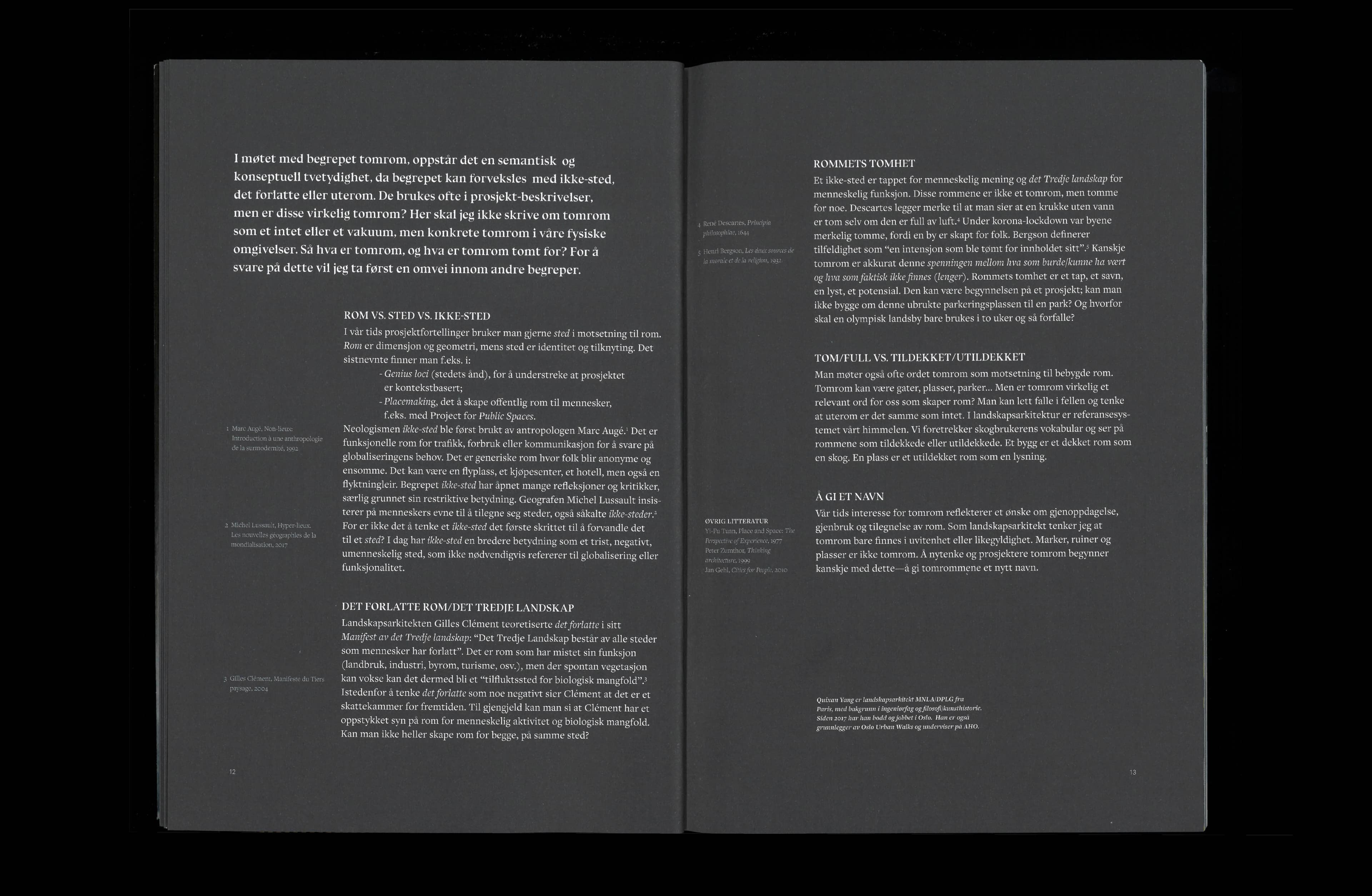
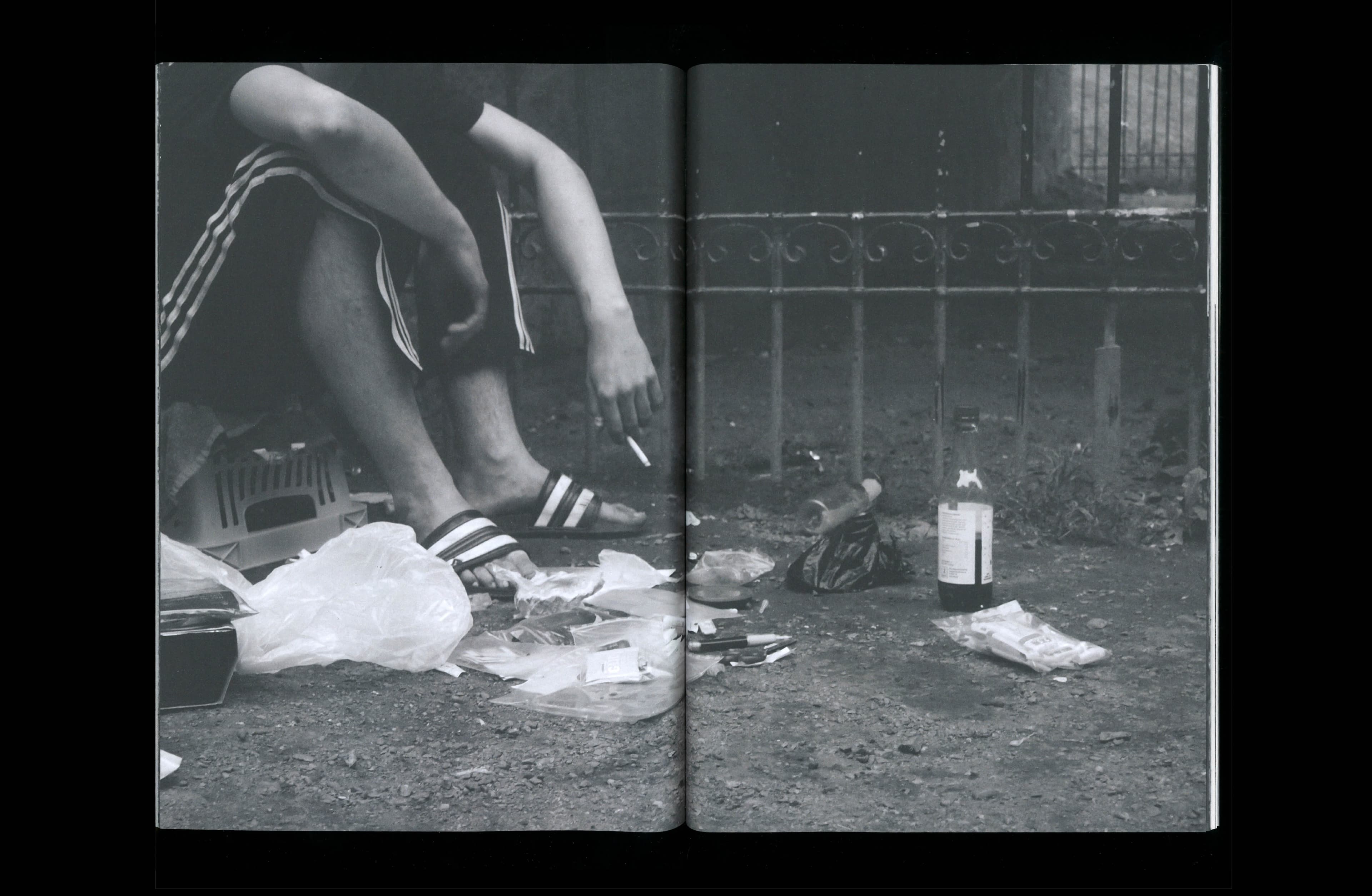
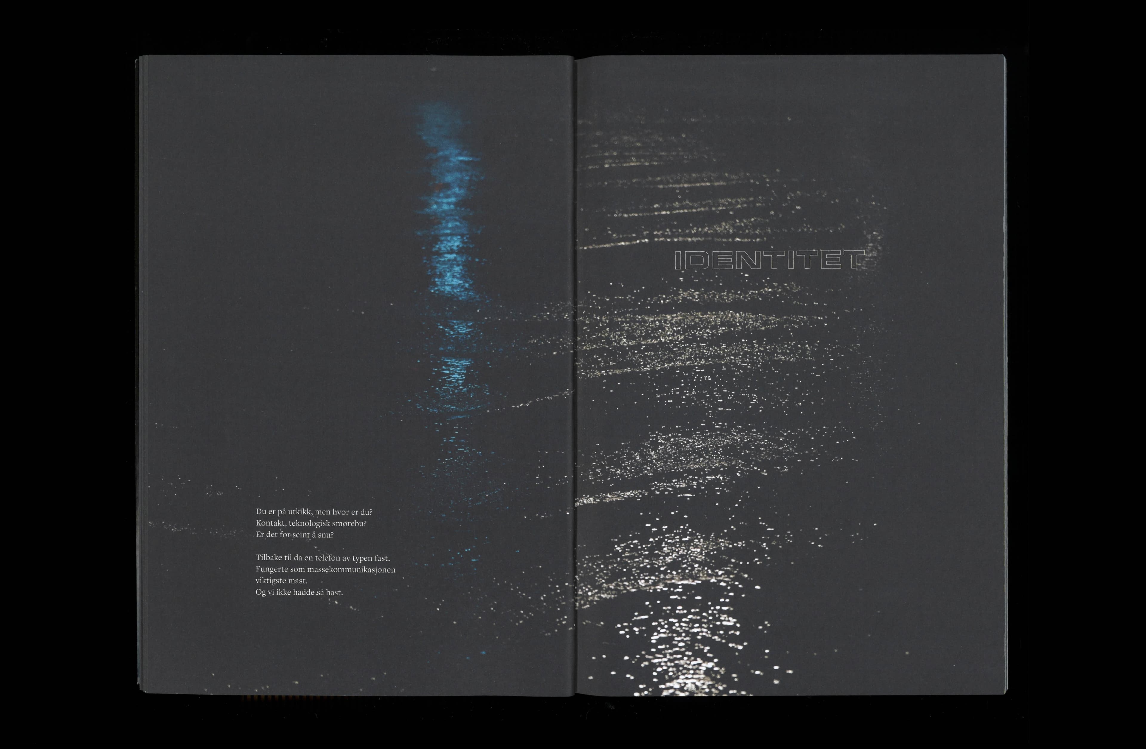
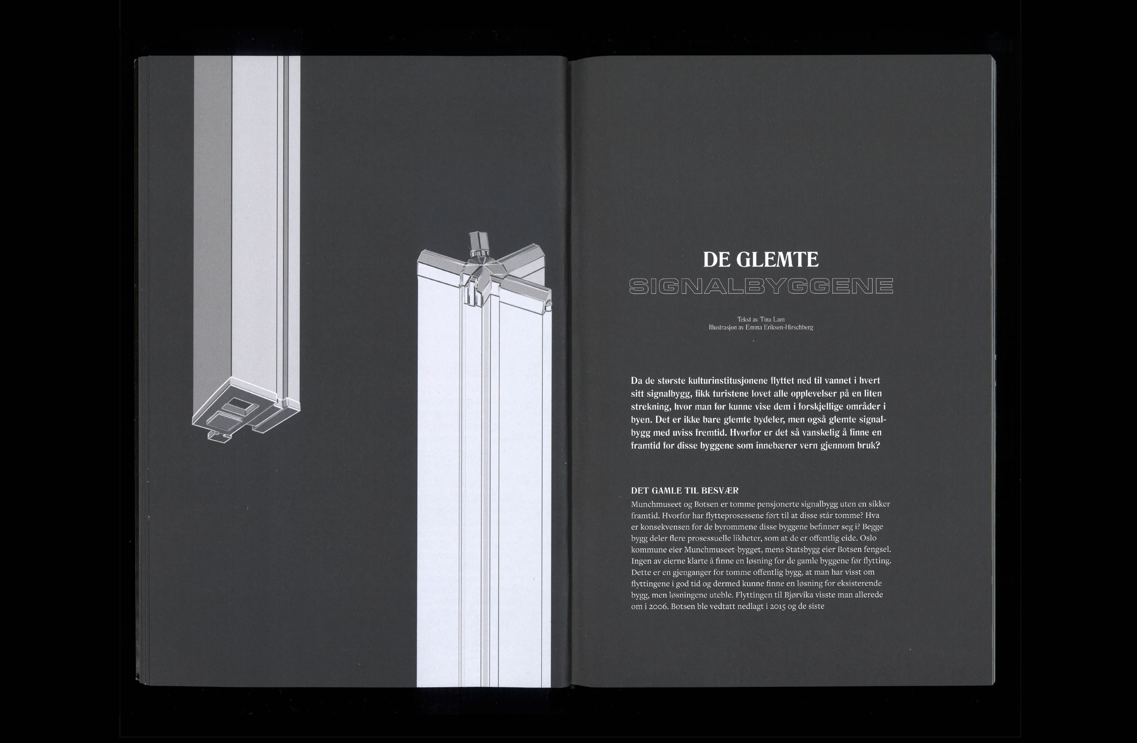
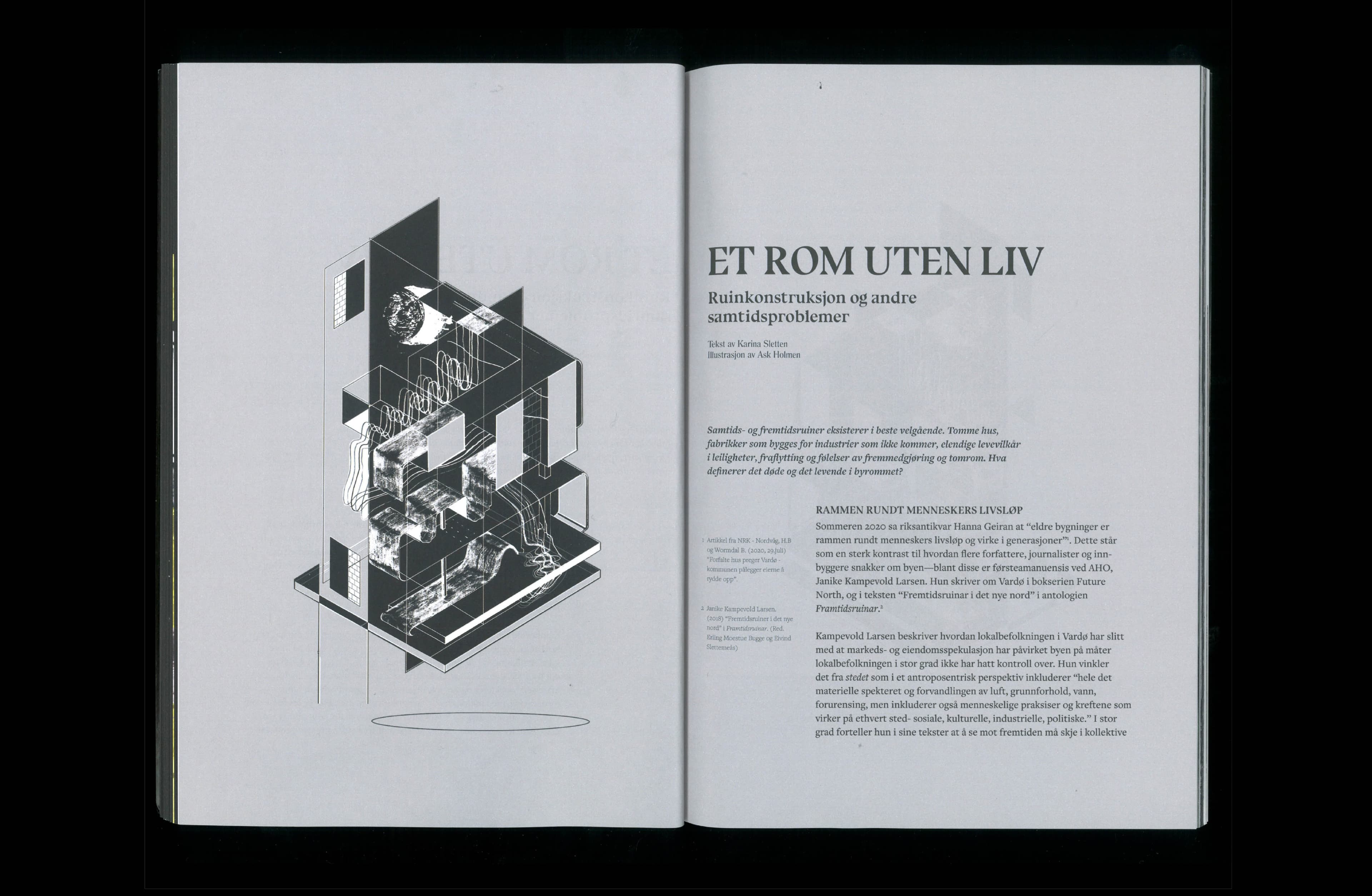
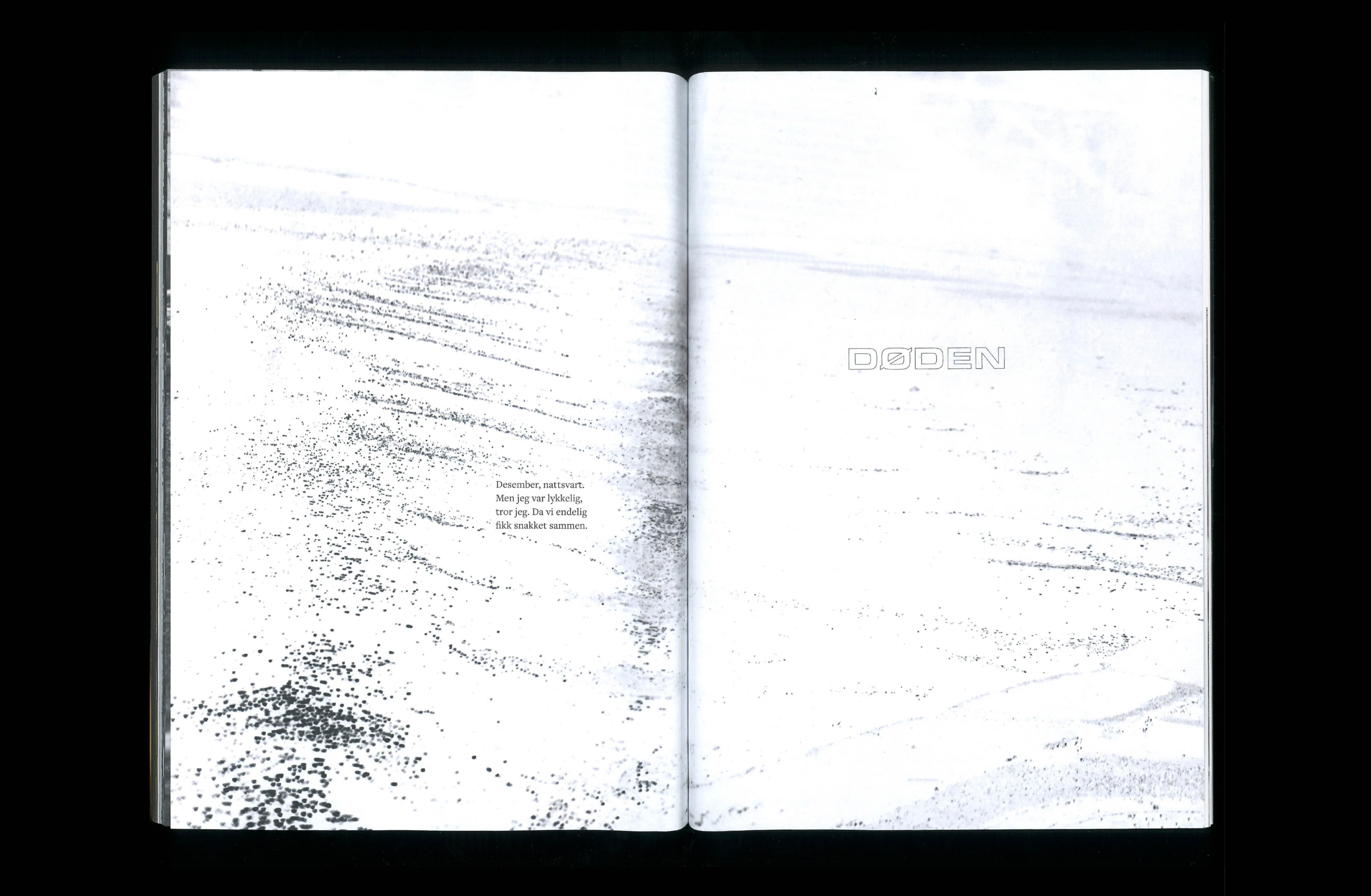
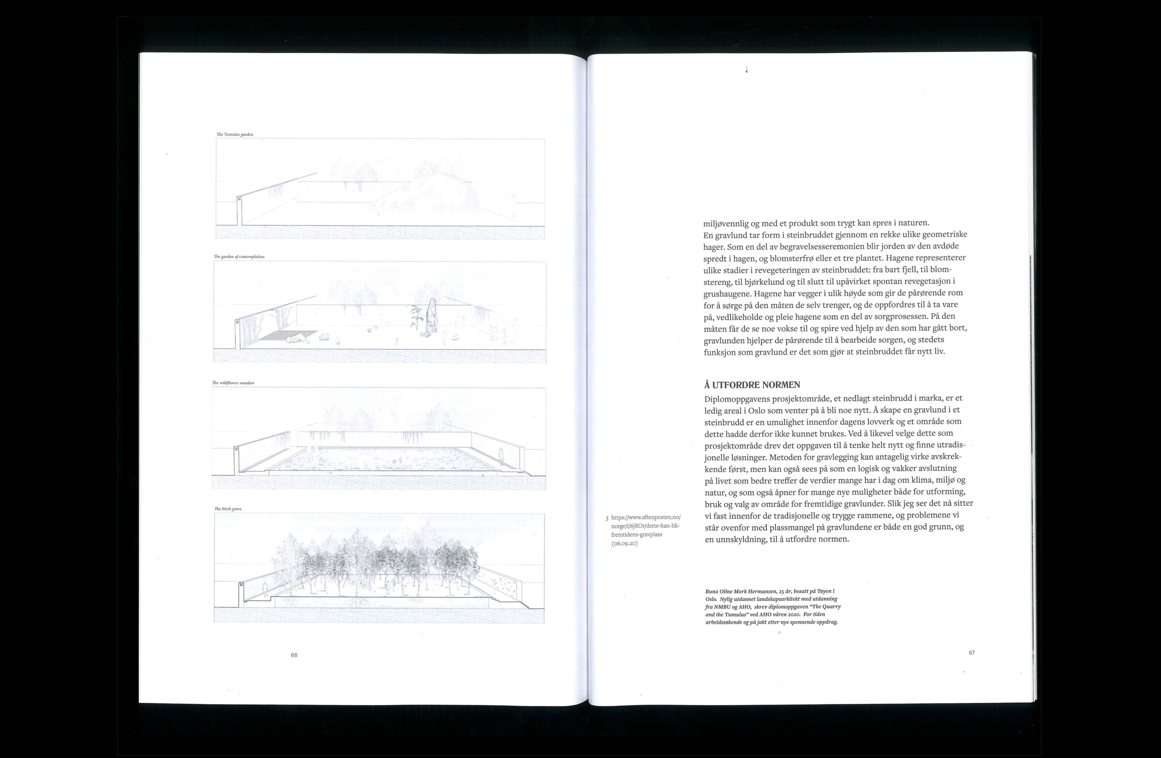
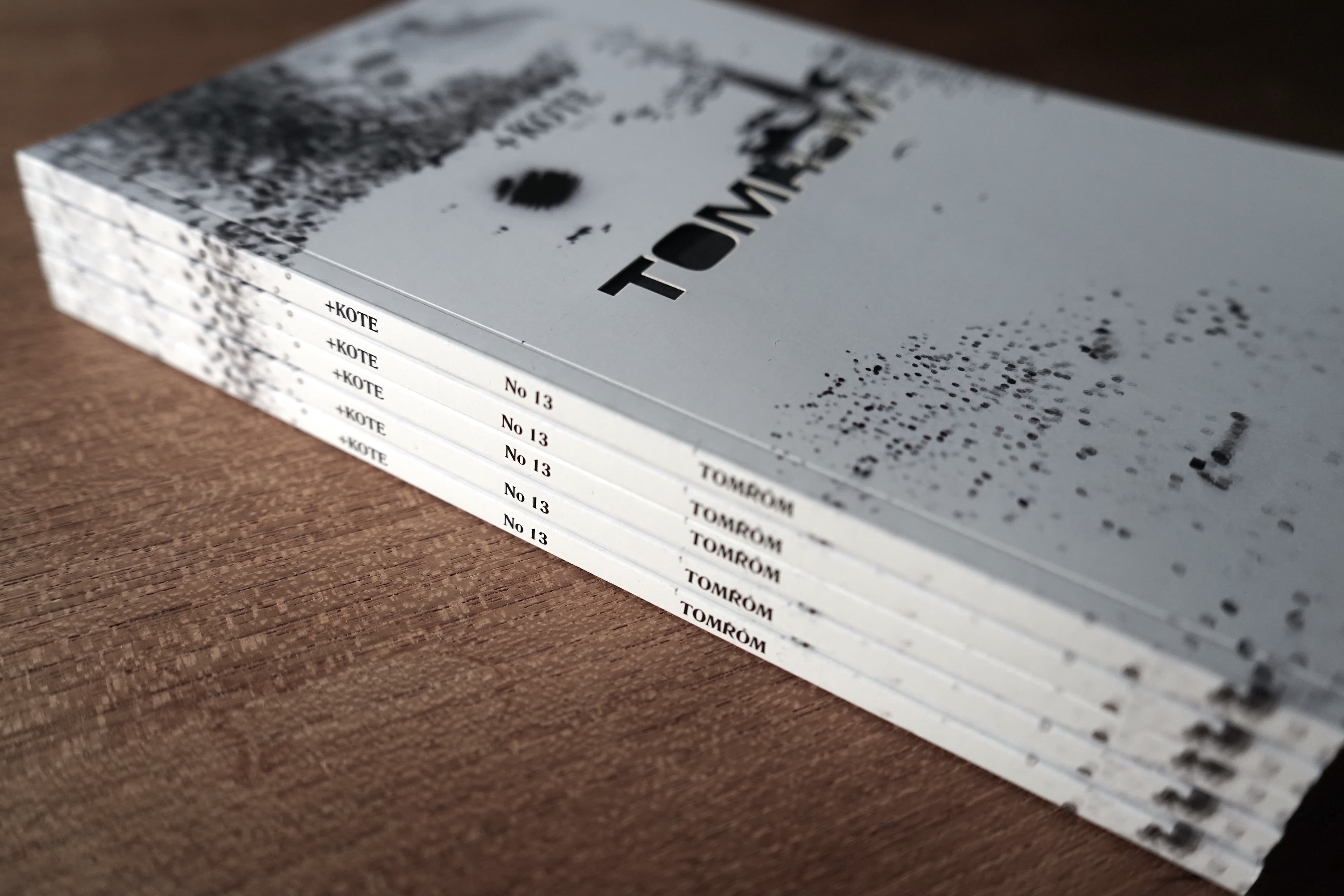
The 13th issue, Tomrom, dwells on topics such as death, identity, drug abuse and alienation. The expression was built around dark, gritty surfaces, gloomy photography and sharp grotesque typography, with words appearing through negative space.
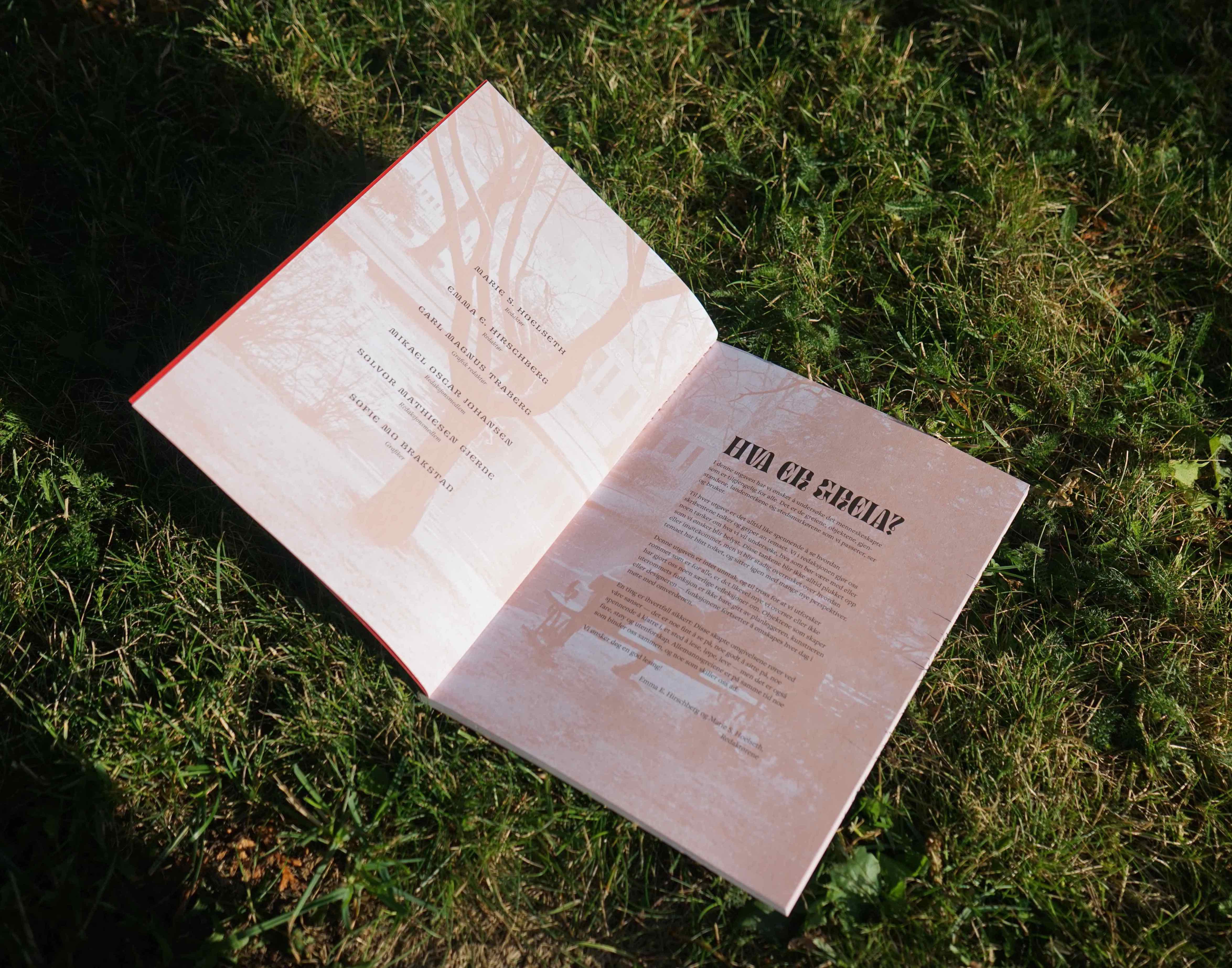
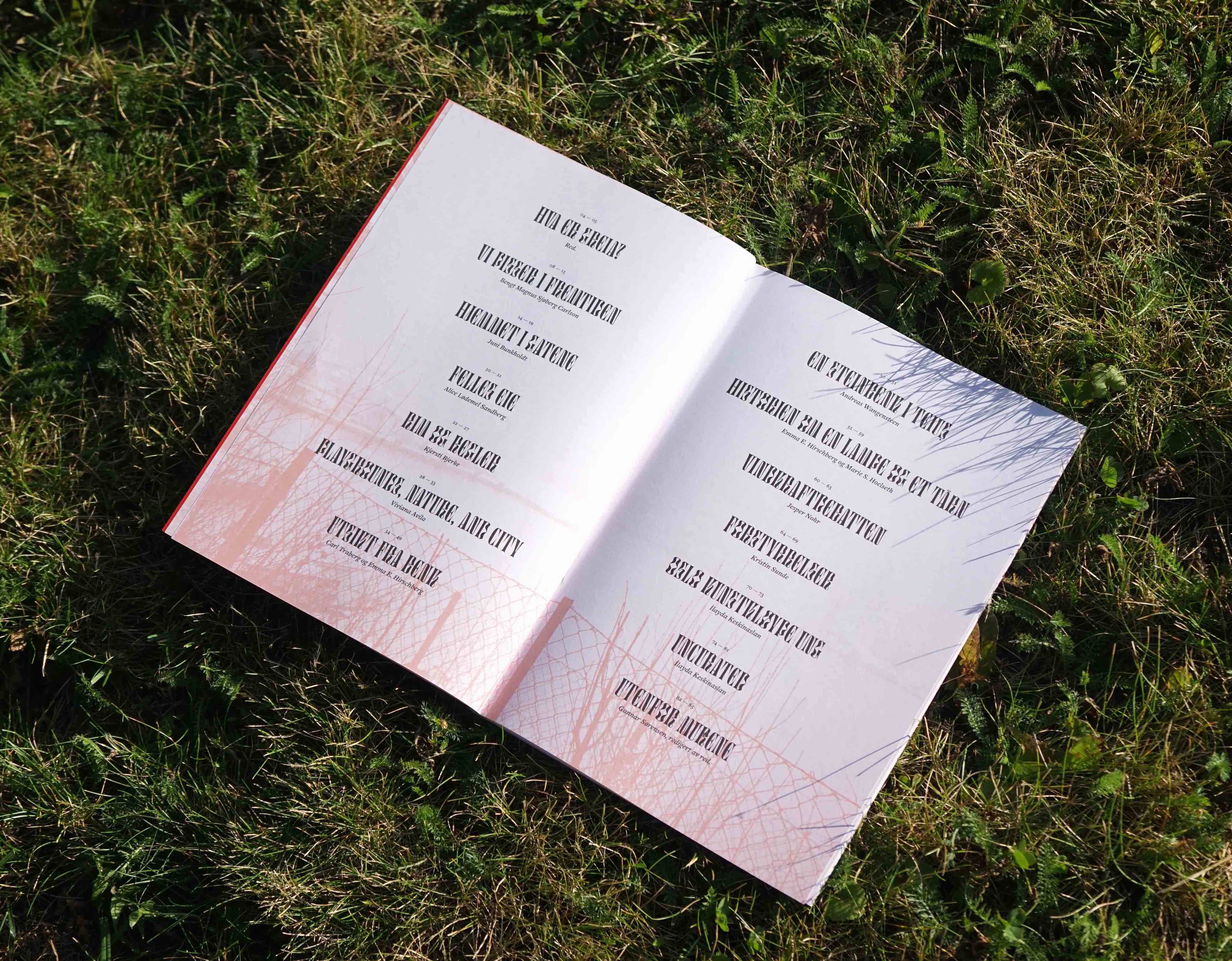
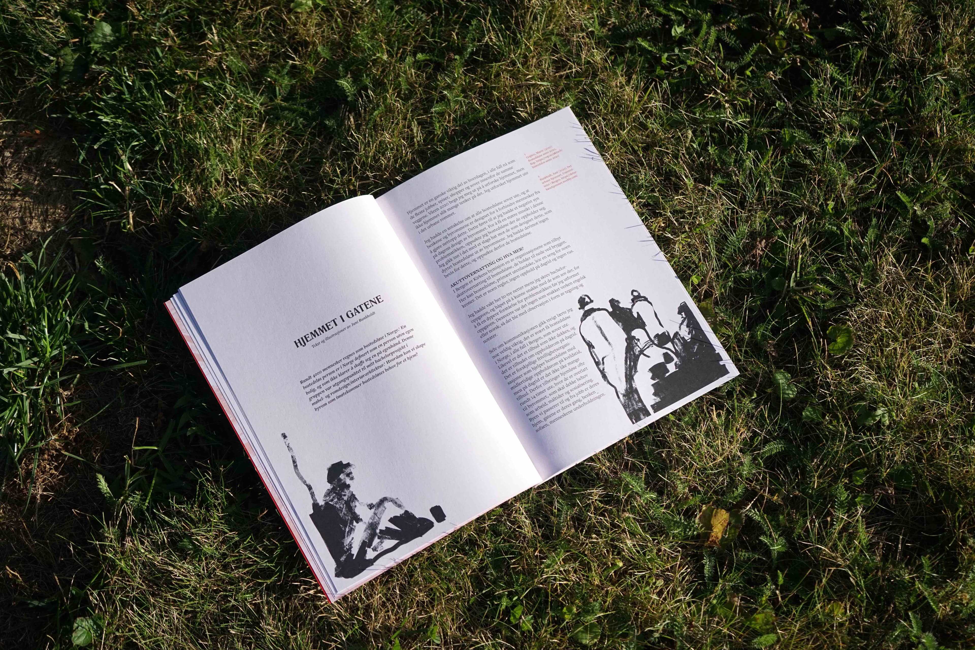
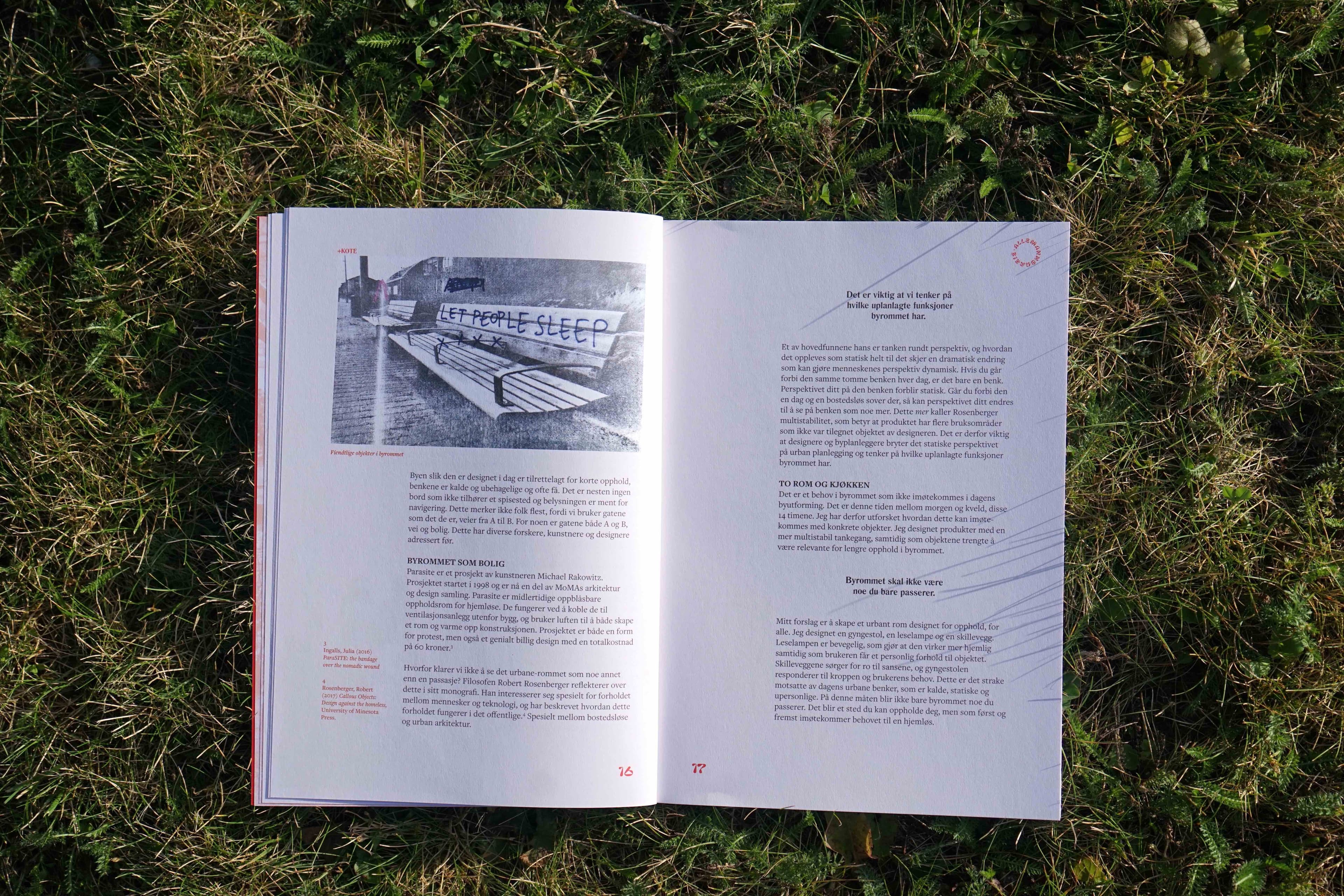
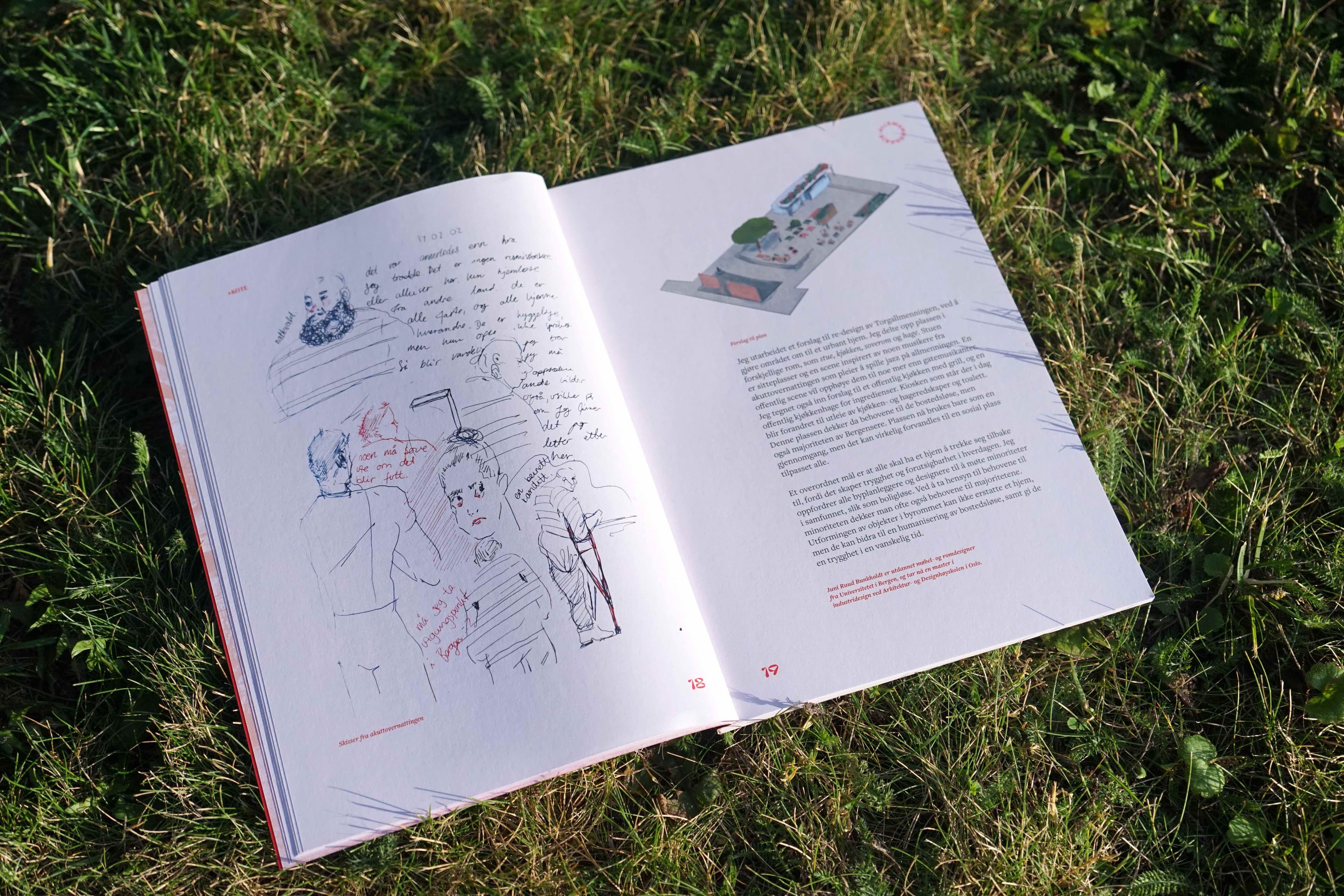
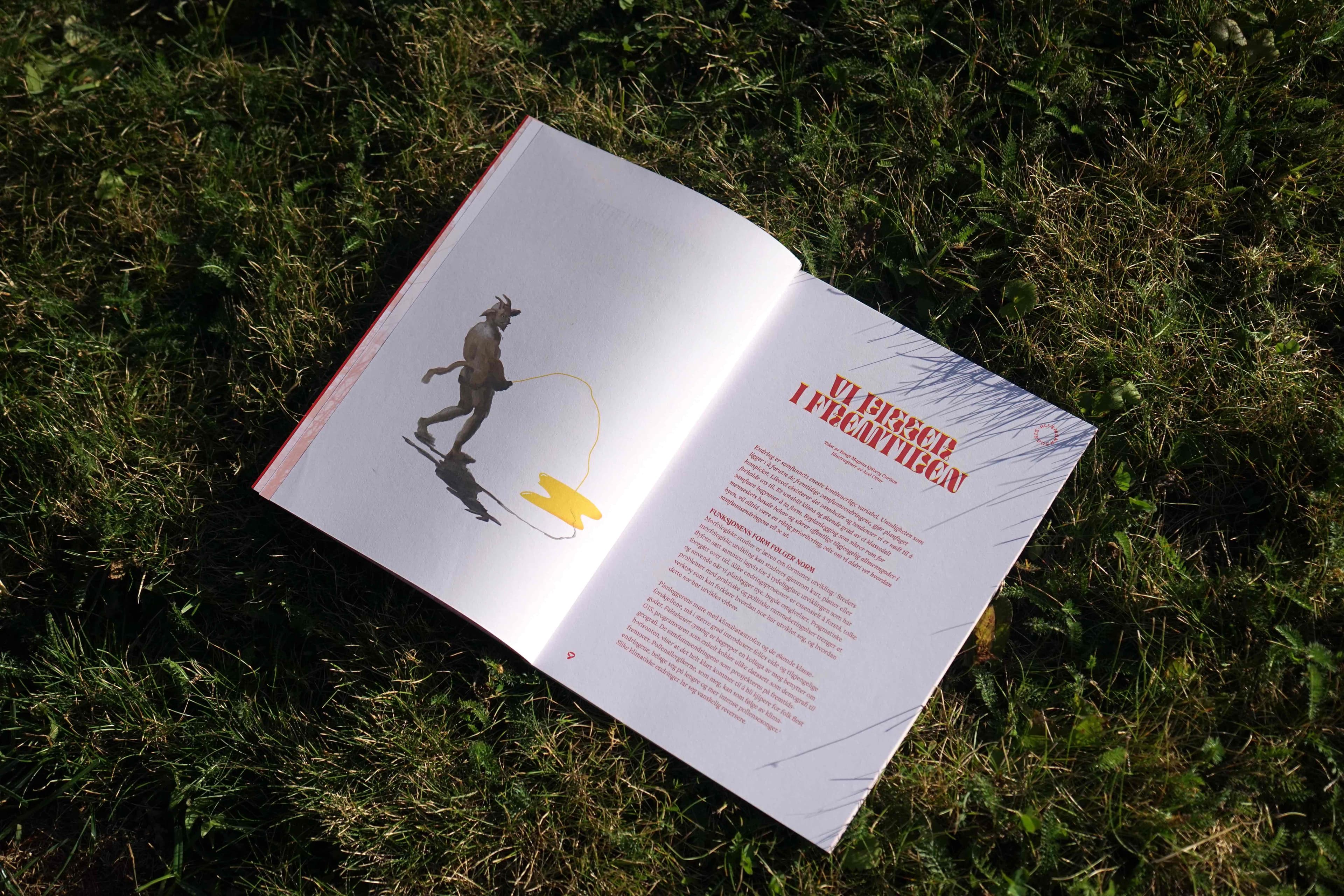
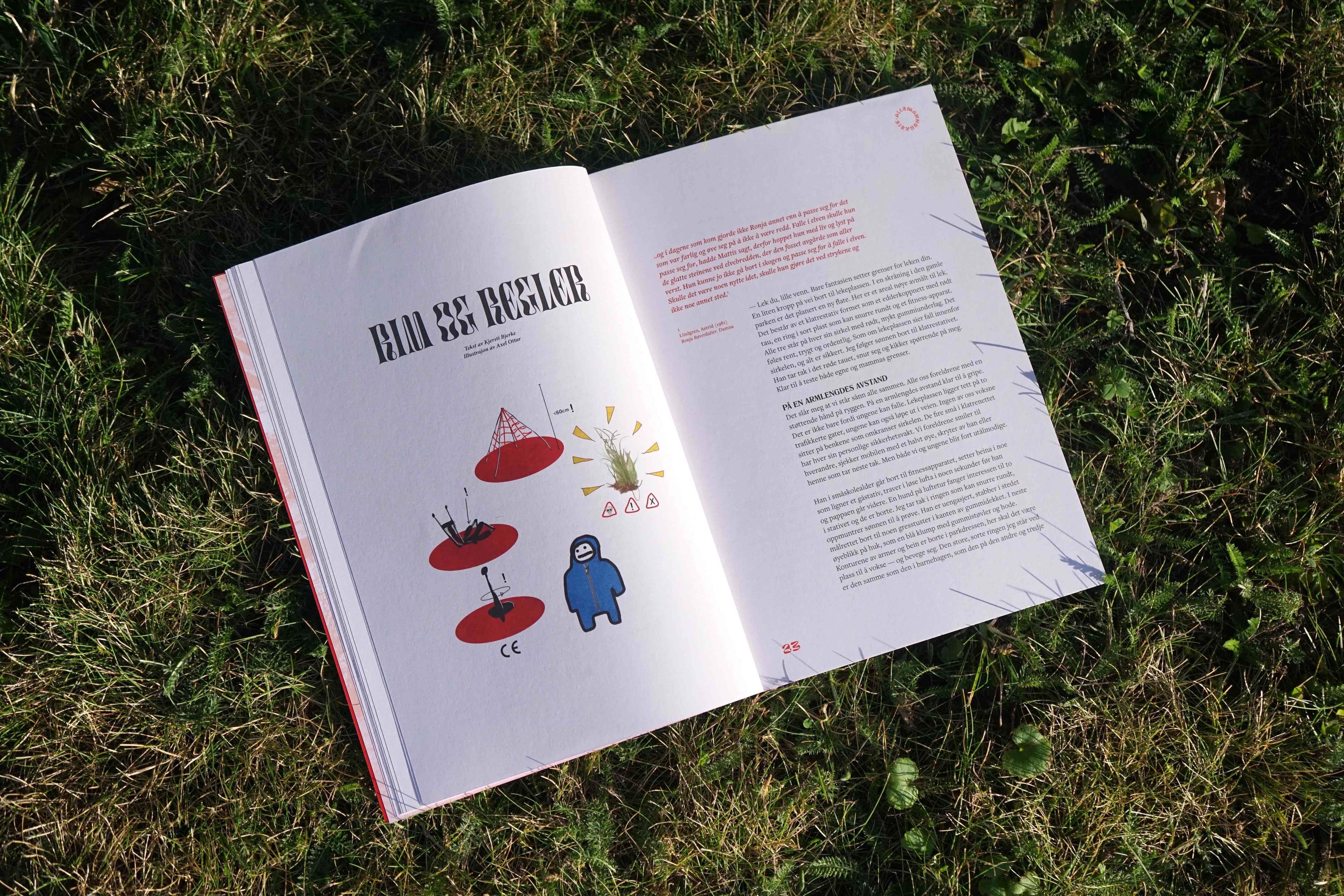
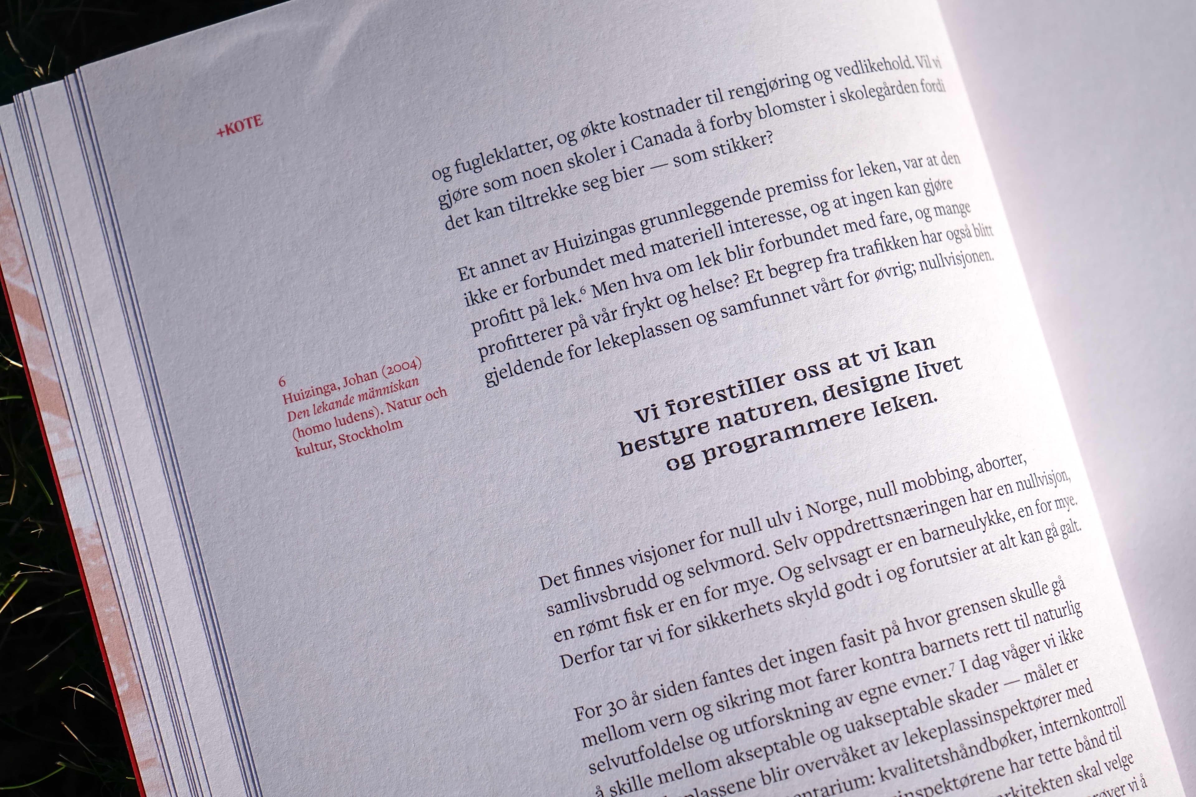
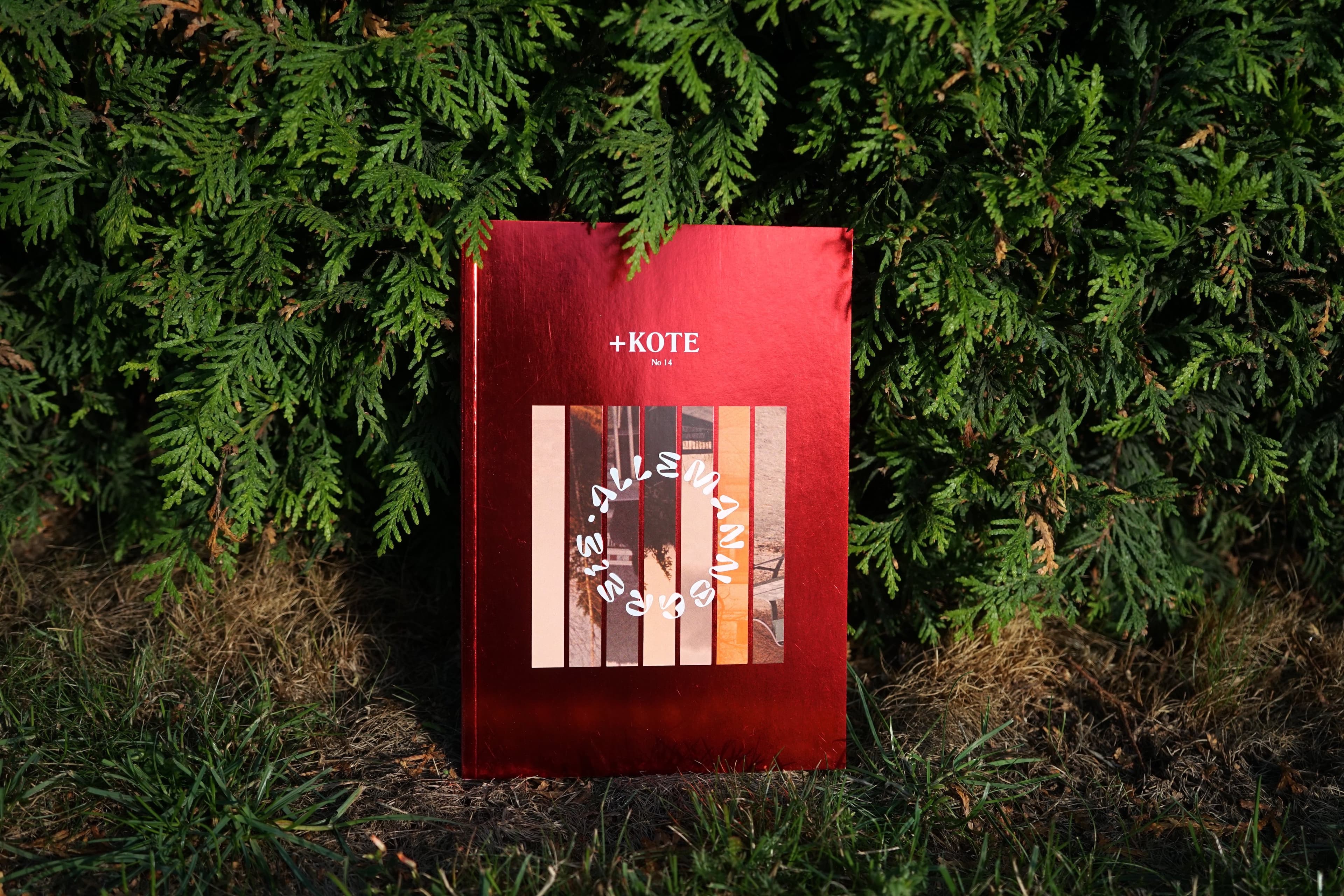
Kote No 14 — Allemannsgreie explored the role of objects in public space. The visual identity became more playful, using squiggly typography and red as a reference to the egalitarian character of Norwegian society.
The cover was wrapped in red foil, turning the publication itself into an object.