Time as paradigm
reMarkable Stacks
- Year
- 2023
- Role
- UX / Interaction designer
- Skills
- Figma, user testing, wireframing
- Context
- Student project
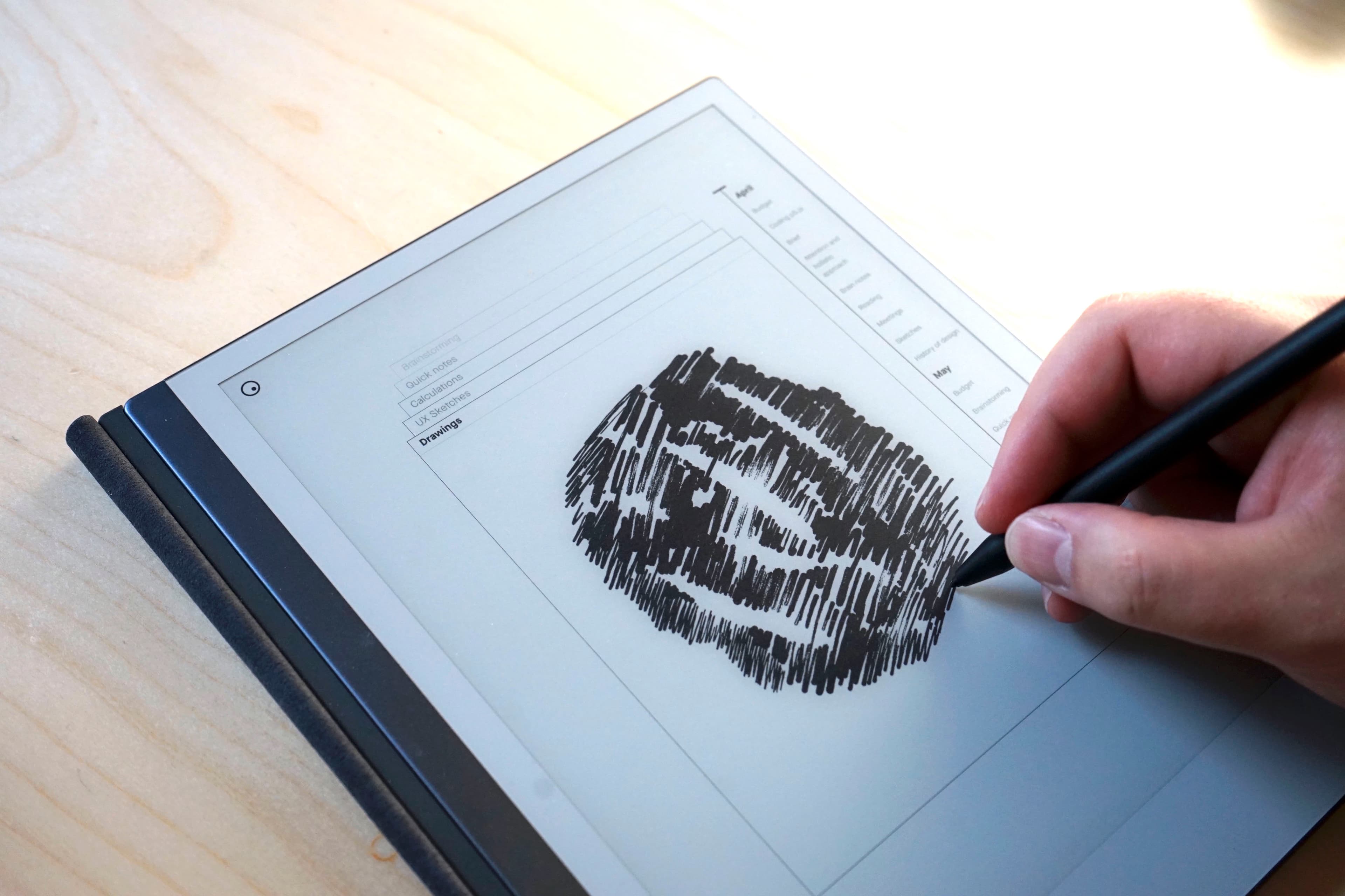
Stacks is an exploratory concept for the UX of the reMarkable 2 device, exploring a more visual and transparent approach to navigating files.
THE PROBLEM
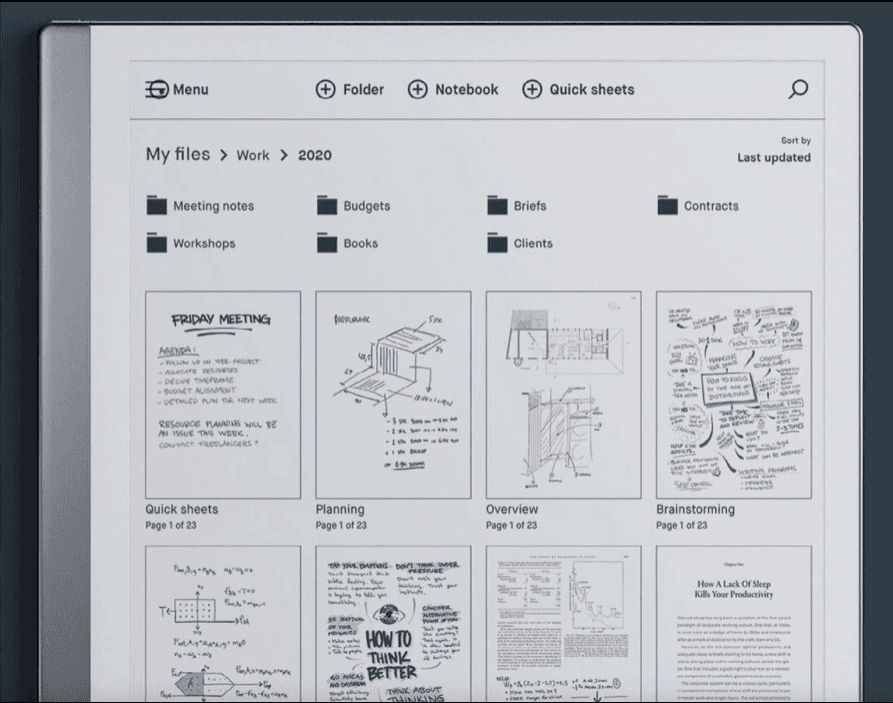
The existing UI had a traditional folder structure. This suits some, but it requires users to enter files and folders in order to see what is inside them. Users do not always remember where they wrote their last note.
QUICK FIX
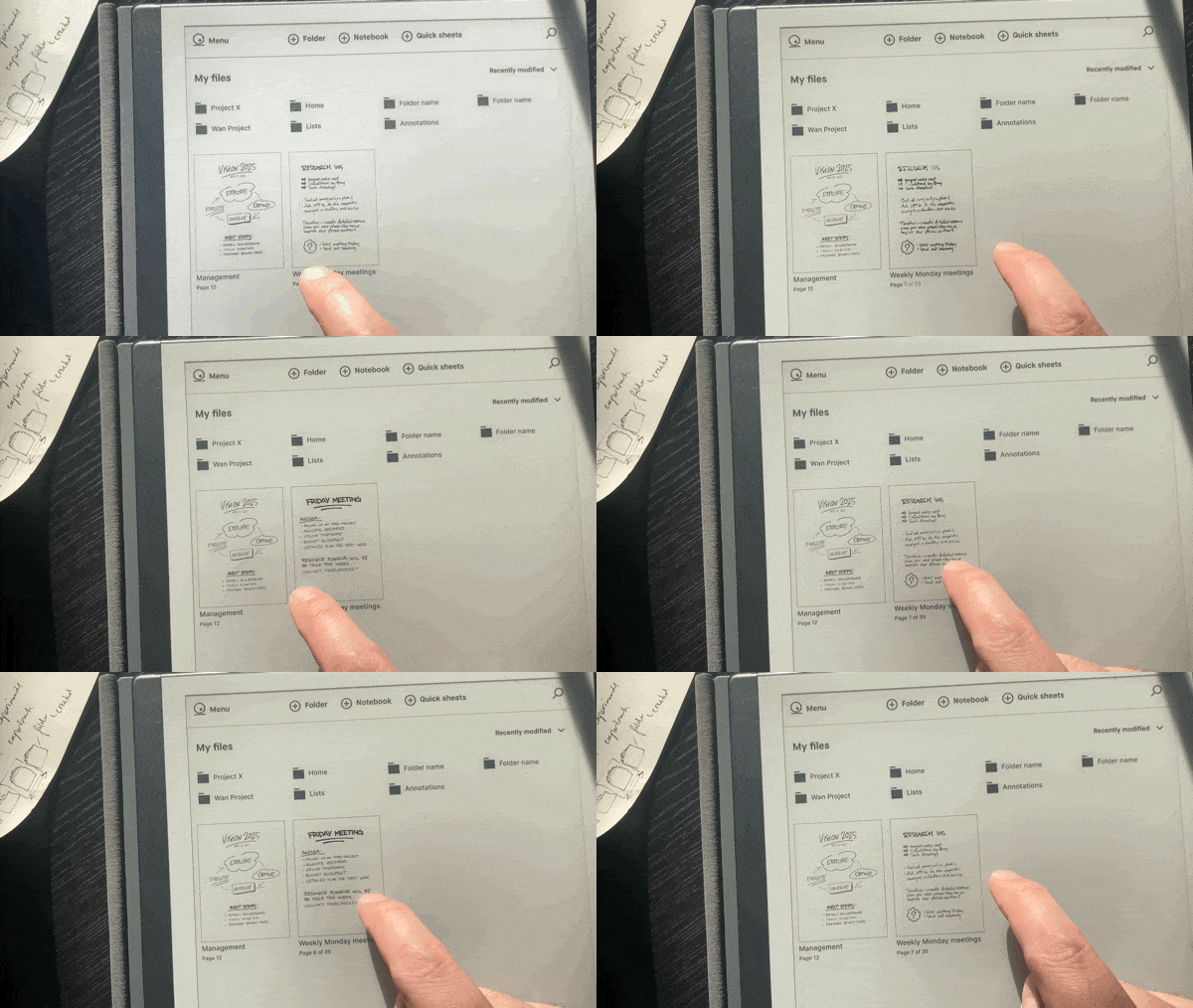
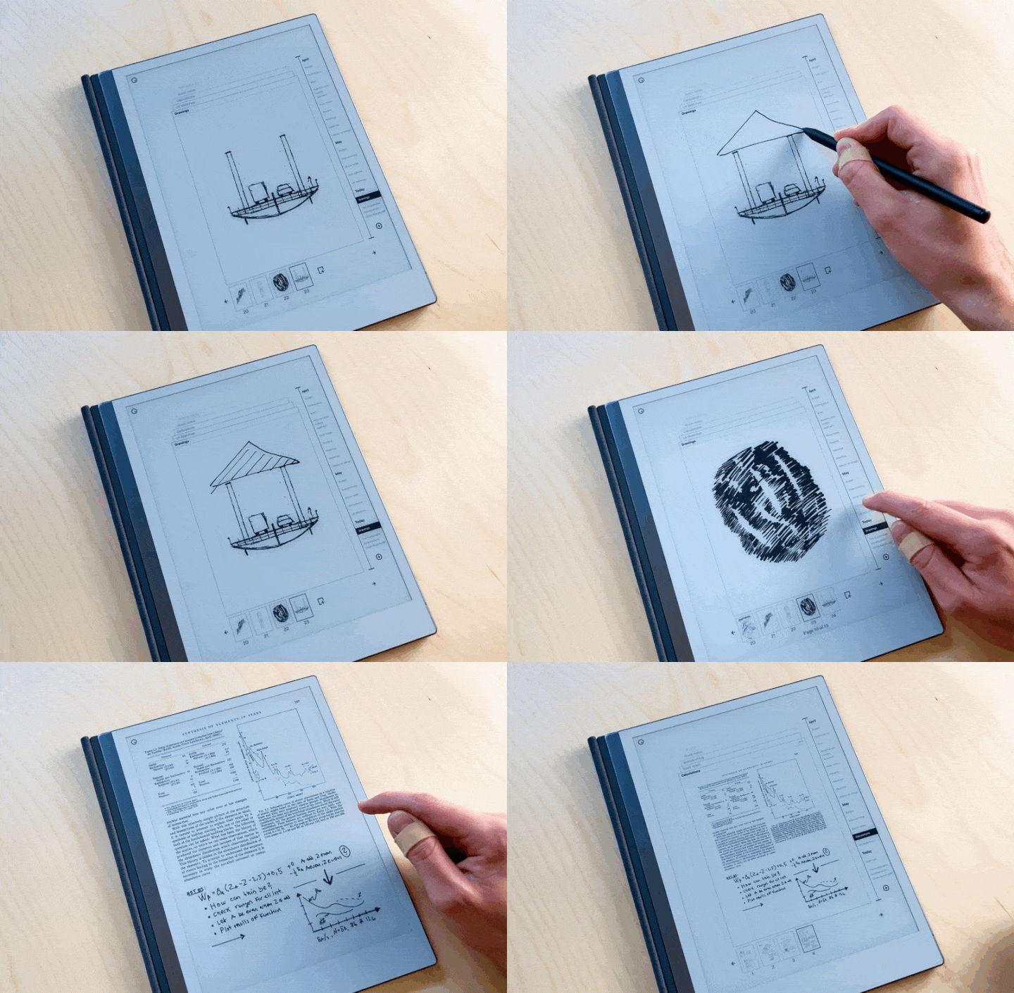
As a quick fix, I prototyped a swiping gesture to preview the content of files. Testing convinced me that small interactions could make the experience more transparent.
EXPLORING TIME
The task from reMarkable was to explore time as an organisational paradigm for the UI.
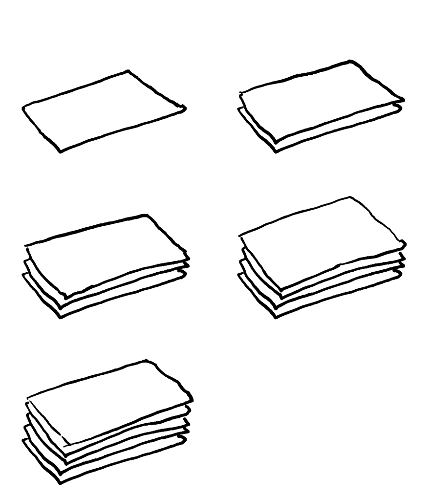
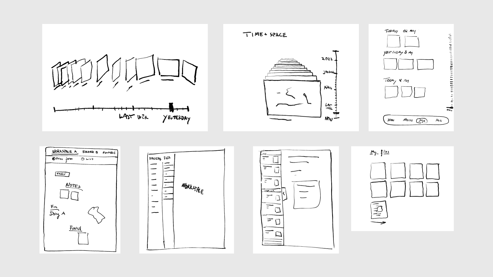
I interpreted time as chronology, which led me to the idea of a stack of paper: older drawings at the bottom, newer on top.
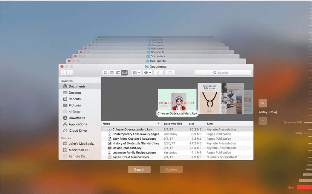
I looked at several examples of how time and chronology are represented, from physical objects, to futuristic UI. Some used direct sequencing, while others used spatial relationships.
I then explored different ways of making time visible through position, sequence and hierarchy.
STACKS
Stacks replace the folder hierarchy with a spatial model based on recency. The latest file sits on top, while the tag system allows for a file to belong to multiple workspaces.
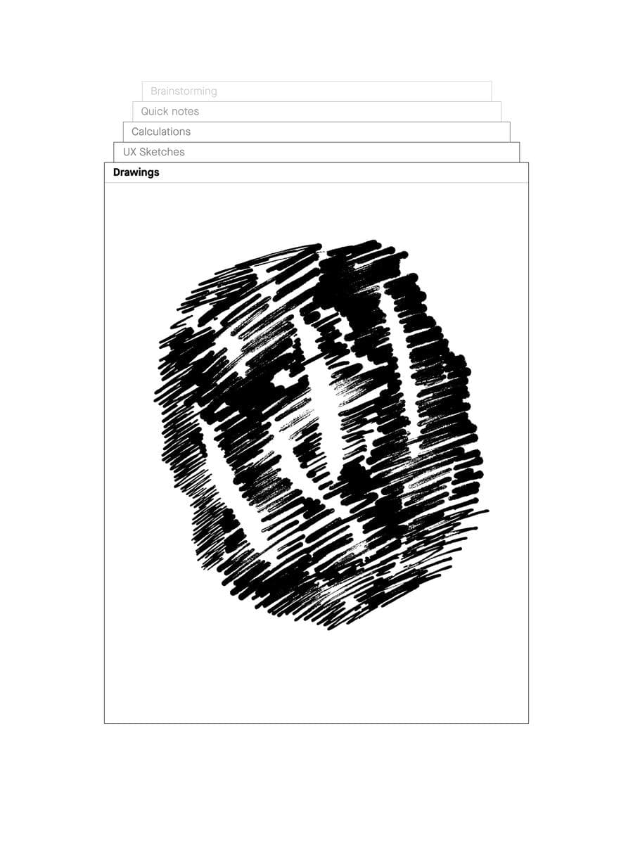
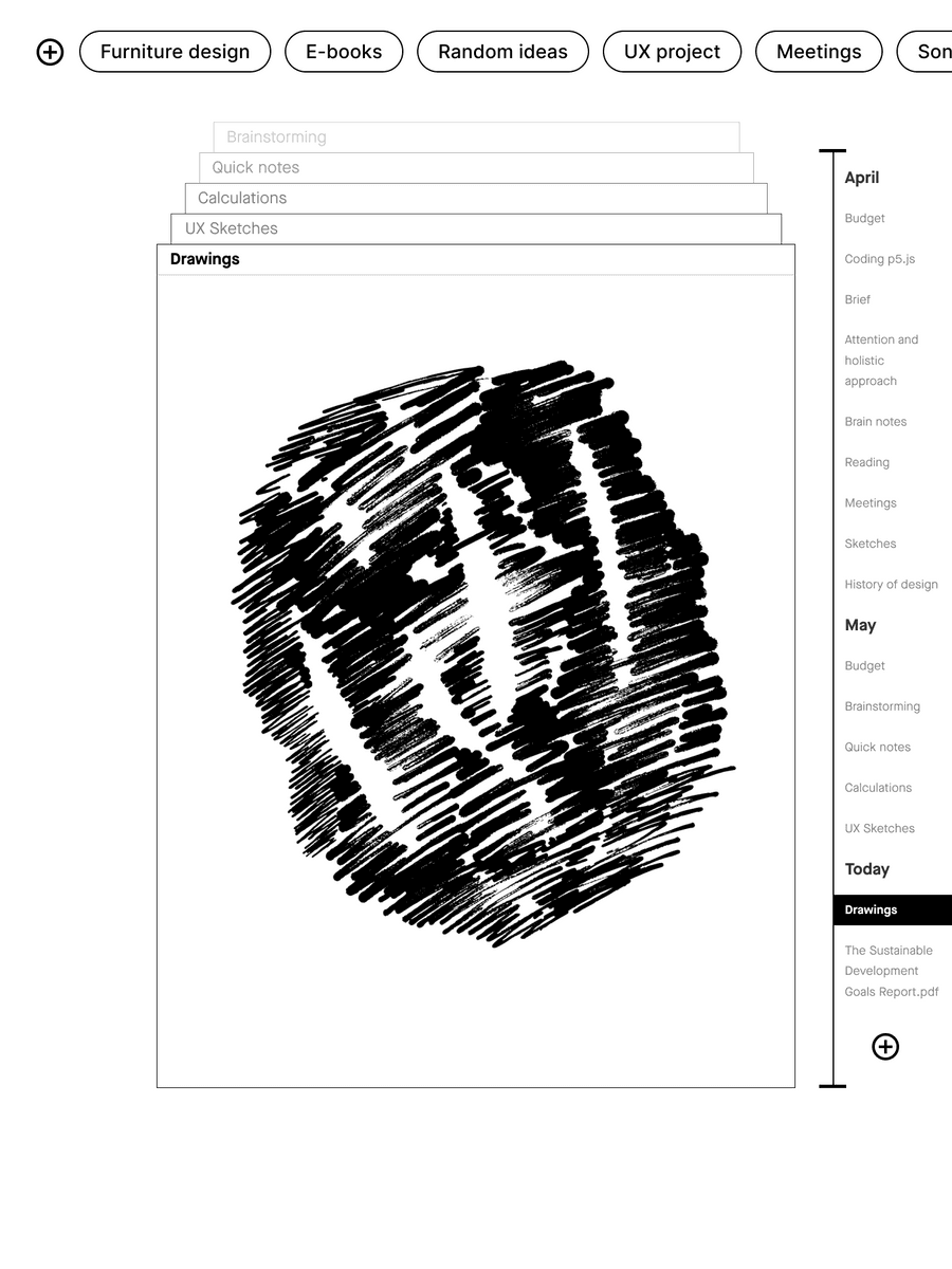
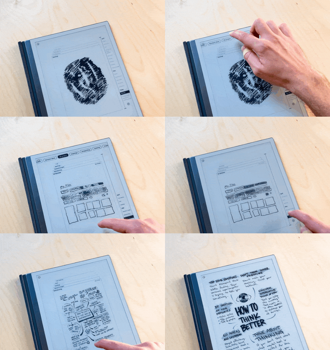
The re-design makes it possible to preview the content of a file before entering it, avoiding the problem of menu diving.
As an alternative to folders, Stacks has a tagging system making it possible to categorise a file into more than one category. It also enable users to work in a “space” rather than a folder.
The project was nominated for the AHO WORKS AWARDS in the category Interaction Design.